Versions Compared

Key

  • This line was added.
  • This line was removed.
  • Formatting was changed.


Excerpt


Diagram

Orientation

You can use the pictograms horizontally and vertically aligned:

  • horizontally for developments over time (Time),

  • vertical for structural comparisons (Structure).

Dual Mode

When Dual Mode is activated, the first two measures are displayed on the opposite axis.

Legend Position

Specify the position of the legend that represents the value per icon. Possible settings are Header (top right), Footer (bottom right) and None (no legend).

Padding

Sets a border around the pictogram. Select a CSS unit from the list (such as 10px, 10em).

Pictogram

Icon Definitions

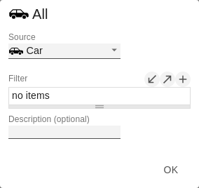
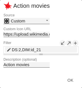
Each entry represents an icon definition. This consists of the attributes Source and Address Subset. Under Source you can select the source of an icon. This can be a valid URL or data URL. Under Address Subset you select the dimension and the associated members for which the icon is to be drawn. If there is an overlap between icon definitions regarding dimensions and members, the last created icon definition takes precedence.

Icon Definition Custom Icon Url

If the 'Custom' option is set for the icon definition, enter a data URL. This data URL is an alternative notation for images.


Info

Representation of a red dot:

"data:image/png;base64,
iVBORw0KGgoAAAANSUhEUgAAAAoAAAAKCAYAAACNMs+9AAAABGdBTUEAALGP
C/xhBQAAAAlwSFlzAAALEwAACxMBAJqcGAAAAAd0SU1FB9YGARc5KB0XV+IA
AAAddEVYdENvbW1lbnQAQ3JlYXRlZCB3aXRoIFRoZSBHSU1Q72QlbgAAAF1J
REFUGNO9zL0NglAAxPEfdLTs4BZM4DIO4C7OwQg2JoQ9LE1exdlYvBBeZ7jq
ch9//q1uH4TLzw4d6+ErXMMcXuHWxId3KOETnnXXV6MJpcq2MLaI97CER3N0
vr4MkhoXe0rZigAAAABJRU5ErkJggg=="
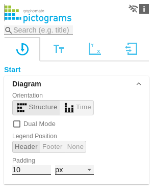
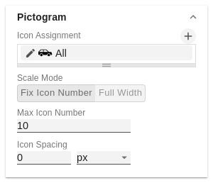

Scale Mode

Text

Max Icon Number

Determine the maximum number of icons per data point. This affects the value that the icon represents. The system tries to find a value for each icon that makes the most sense so that the actual maximum number of icons is less than or equal to the number you specify.

Icon Spacing

Defines the distance between two icons (within a data point).

A valid CSS string such as 10px, 10em, etc. is expected.

 Select a CSS unit from the list (such as px, em).


Title

If the Enable checkbox is activated, the title is displayed.

Title Text

Define a title for your pictogram here.

Font Size

Specify the font size here. Select a CSS unit from the list (such as px, em).

Spacing

Defines the distance of the header area to the pictogram. A valid CSS string such as 10px, 10em, etc. is expected Select a CSS unit from the list (such as px, em).

Footer Text

Here you can define a text that appears below the pictogram.

Font Size

Specify the font size here. Select a CSS unit from the list (such as px, em).

Spacing

Defines the distance between the footer area and the pictogram. A valid CSS string such as 10px, 10em, etc. is expected Select a CSS unit from the list (such as px, em).

Tooltips

If this check mark is ticked, tooltips will be displayed on the pictograms at runtime, providing detailed information for the corresponding element.


...