...
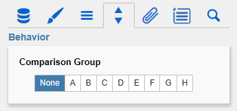
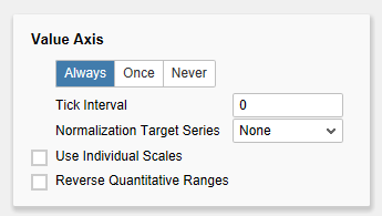
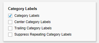
Comparison GroupSeveral bullet graph components can be scaled identically by using the same Comparison Group, which is activated by the checkbox. The comparison group will then be shown during design time on the top right corner of the component. That way the minimum and maximum of the data basis in this group is used. Comparison groups are used globally within the BIApp, ie also graphomate charts, graphomate tiles as well as deviation charts in the graphomate tables are scaled identically by using the same comparison group abbreviation. Category LabelsThis section controls the labels of the bullet graphs. If the first checkbox is activated, the category labels are displayed for each bullet graph. Center Category Labels If this option is active, category labels are centered in front of/above the bullet graph bars. Trailing Category Labels If activated, the category labels will be shown behind/below the bars. Otherwise, the labels will be placed in front of/above the bars. If the last checkbox is activated, repeating category labels will be suppressed. Value AxisThis option controls the display of the value axis. Always draws one value axis for each bullet graph; Once draws a single value axis, which applies to all bullet graphs. This appears at the bottom of the component above the footer. Never suppresses the display of the value axis completely. Tick IntervalThis value governs the ticks along the value axis. If e. g. a 5000 is entered, a tick is displayed at 5000, 10000, 15000 etc. The default 0 generates an appropriate number of ticks for the available space. Currently, normalized data (see next option) is not supported. Please note that rendering is slowed down considerably if the data is very large, and a small tick interval is entered. Normalize to TargetIf the option Normalize to Target Value is activated, all values will be normalized to a single value which can be selected from the dropdown box Target Series. The selected value will be interpreted as 100%; all other values are calculated into percentages accordingly. If the property Value Axis is set to Always, the underlying values will be displayed, if set to Once, the value axis will display the calculated percentages. This option is deactivated if the component is registered in a comparison group. Use Individual ScalesIf this checkbox is activated, each bullet graph's axis is calculated individually. Otherwise, all bullet graphs are scaled identically. When choosing Value Axis option Once, Use Individual Scales is disabled, as is the case if the component is registered in a comparison group. Reverse Quantitative RangesThis checkbox controls the representation of the axis. If this option is activated, the axis is drawn from n to 0, otherwise the scaling is inverted – from 0 to n. Category LabelsThis section controls the labels of the bullet graphs. If the first checkbox is activated, the category labels are displayed for each bullet graph. Center Category Labels If this option is active, category labels are centered in front of/above the bullet graph bars. Trailing Category Labels If activated, the category labels will be shown behind/below the bars. Otherwise, the labels will be placed in front of/above the bars. If the last checkbox is activated, repeating category labels will be suppressed. Chart AlignmentThis checkbox describes the orientation of the bullet graphs. If it is activated, they are displayed vertically, otherwise they are displayed horizontally. |
...


