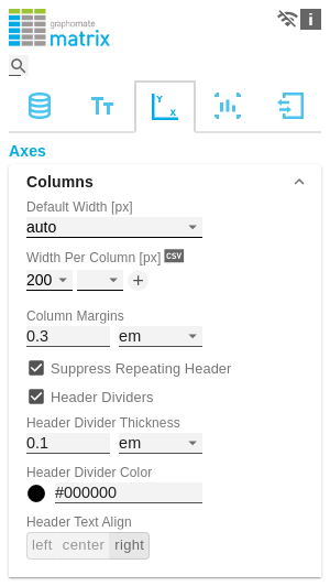
ColumnsDefault Width [px]At this point, define the default value for column width in px. The value auto causes the available space of the matrix to be divided among all columns that are assigned the default width, i.e. all columns for which the Width Per Column property does not specify a different value. Width Per Column [px]This property can be used to set an individual width for each column of the matrix. The column at position 0 corresponds to the row titles. The width is specified in pixels.
For a table with one row title column, two data columns and one deviation column, a possible list looks like this: [200, auto, auto, 300].
If the value default is set for one or more columns, then the value of the Default Width property (described above) is used for them. If the value auto is set for one or more columns, then the remaining space of the matrix component is automatically divided among these columns so that no scrollbar is created. If the value hide is selected, the corresponding column will be hidden. Hiding is done only visually. When specifying indices e.g. in the CFL, hidden columns are still counted. Via the csv button you have the possibility to enter the column widths as comma-separated values. Column MarginsThis property sets the distance between columns, in any CSS length unit. If members repeat themselves consecutivley in a column header row, this property can be used to display them only once in succession. Here you can set the visibility of the horizontal separator lines below column header cells. Here you can set the thickness of the horizontal dividing lines of column header cells. Select a CSS unit from the list (such as px, em). Here you set the color of the horizontal separator lines of column header cells as HEX, RGB or HSL code. You can switch this using the small arrows on the right side of the color picker, which can be opened by clicking on the colored circle. Set here whether column headers should be left-aligned, right-aligned or centered. |