| Excerpt |
|---|
SynchronizeComparison GroupMittels der Comparison Group skalieren Sie mehrere Diagramme identisch. Bei Zuweisung einer Comparison Group wird im Diagramm Overlay angezeigt.
Vergeben Sie für alle betreffenden Diagramme ein identisches Gruppenkürzel. Nun wird das Minimum und Maximum der Datenbasis dieser Gruppe genutzt. | Warning |
|---|
Dies Funktion wird nur von folgenden Umgebungen unterstützt: - Microsoft Excel
- SAP Analytics Cloud
- SAP Lumira Designer
|
Synchronize PaddingGibt an, ob das Padding aus der Comparison Group übernommen oder ob dieses für das Diagramm selbstständig ermittelt werden soll. Synchronize ScalingGibt an, ob die Skalierung aus der Comparison Group übernommen oder ob diese für das Diagramm selbstständig ermittelt werden soll. Synchronize Axes PositionGibt an, ob die Achsenpositionen aus der Comparison Group übernommen oder ob diese für das Diagramm selbstständig ermittelt werden sollen. | 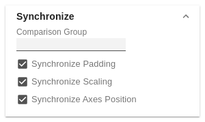 Image Removed Image Removed
|
ScalingDie Standardeinstellung automatic skaliert das Diagramm entsprechend der Min und Max-Werte aus allen abzubildenden Daten. Alternativ können Sie unter manual Min/Max-Skalierungswerte für Absolut- und Prozentwerte manuell setzen. Chart Min-Werte > „0“ schneiden die Werteachse ab. | 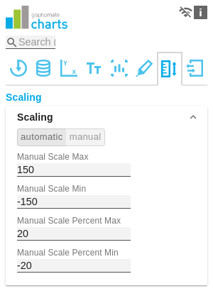 Image Removed Image Removed
|
OutliersIst die Eigenschaft Outliers aktiviert, wird der manuell definiert Wert ab dem Ausreißer dargestellt werden verwendet. short - longHier wählen Sie, wie genau Ausreißer dargestellt werden. Im Modus short werden die Ausreißer als kleine Dreiecke an der Achse dargestellt. Im Modus long werden die Ausreißer hingegen über die gesamte zur Verfügung stehende Fläche – gemäß den Regeln nach IBCS – dargestellt. SizeDie Größe des Ausreißerzeichens in Pixeln. Negative/Positive ThresholdIst bei automatischer Skalierung der Wert, bis zu dem sich im Diagramm alles automatisch skaliert. Übersteigt ein Wert in den Daten diese Grenze, wird dieser Wert nicht für die Maximum-Berechnung verwendet. Alle Werte über diesem Wert werden dann entsprechend als Ausreißer angezeigt. Negative/Positive Threshold PercentGleiche Funktion wie Negative/Positive Threshold, jedoch für Prozentwerte in den Abweichungsdiagrammen. | 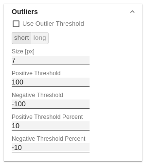 Image Removed Image Removed
|
Scaling Helper
Hier aktivieren und bestimmen Sie das Aussehen Linie (line) oder Fläche (area).
Value
Tragen Sie hier den Wert für die Position des Scaling Helpers ein.
Line / Area Color
Definieren Sie über den Color Picker oder einen Hex-Code die Farbe der Linie (Line Color) oder der Fläche (Area Color)
Bar Line Width [px]
Bestimmen Sie die Linienbreite des Scaling Helpers in Pixel| Excerpt |
|---|
ScalingThe default setting automatic scales the diagram according to the Min and Max values from all data to be displayed. Alternatively, you can manually set min/max scaling values for absolute and percentage values under manual. Chart min values > "0" intersect the value axis. | Image Added | SynchronizeComparison GroupYou can use the Comparison Group to scale several charts identically. When you assign a Comparison Group, Overlay is displayed in the diagram.
Assign an identical group abbreviation for all diagrams concerned. Now the minimum and maximum of the data basis of this group is used.
| Info |
|---|
Comparison Group in Power BI:
Use unique abbreviations. For example, "ReportName_AA" instead of just a letter like "A" or "B". Otherwise, the Comparison Group may not synchronise in the reports. |
| Warning |
|---|
This function is not supported by Tableau Desktop. |
Synchronize PaddingSpecifies whether the padding should be taken from the Comparison Group or whether it should be determined independently for the diagram. Synchronize ScalingSpecifies whether the scaling should be taken from the Comparison Group or whether it should be determined independently for the diagram. Synchronize Axes PositionSpecifies whether the axis positions should be taken from the Comparison Group or whether they should be determined independently for the chart. | Image Added | OutliersUse Outlier ThresholdIf the Outliers property is activated, the manually defined value from which outliers are displayed is used. short - longHere you select how outliers are displayed. In short mode, the outliers are displayed as small triangles on the axis. In long mode, however, the outliers are displayed over the entire available area, according to IBCS rules. Size [px]The size of the outlier character in pixels. Negative/Positive ThresholdWith automatic scaling, this is the value up to which everything in the diagram scales automatically. If a value in the data exceeds this limit, this value is not used for the maximum calculation. All values above this value are then displayed accordingly as outliers. Negative/Positive Threshold PercentSame function as Negative/Positive Threshold, but for percentage values in the deviation diagrams. | Image Added | Scaling HelperHere you can activate and define if the Scaling Helper appears as a line or area. ValueEnter the value for the position of the Scaling Helper here. Line ColorUse the Color Picker or a HEX code to define the color of the line (Line Color). Bar Line Width [px]Specify the line width of the Scaling Helper in pixels. Area ColorUse the Color Picker or a HEX code to define the color of the area (Area Color). | 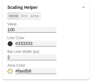 Image Modified Image Modified
|
|