DataThe Select Data icon in the overlay UI opens the dialog. The base value (Measure) and the target value (Target) of the progress bar can be selected from the data source here. | |
TitleActivate the checkbox to add a title to the module. Title TextThe title can be entered here. Use HTML tags to format it. The following HTML tags can be used for this: 'b', 'i', 'p', 'span', 'div', 'br', 'h1', 'h2', 'h3', 'h4', 'h5', 'h6', 'hr', 'ol', 'ul', 'li' und 'blockquote'. Font SizeAdjust the font size of the title.
| 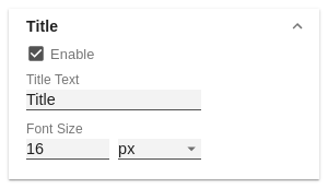 Image Added Image Added
|
TargetEnable Target IndicatorActivate or deactivate the target value indicator. This is activated by default. Color of IndicatorSets the color of the indicator. Indicator Border WidthSet the line width of the indicator in px here. DataThis also influences the size.
| 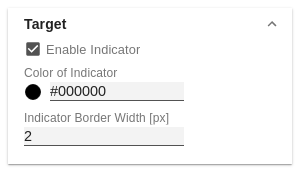 Image Added Image Added
|
ThresholdsTarget Offset [%]Enter the percentage by which the bar should be extended in addition to the target value in order to create space for surplus. This only has an effect if To Target was selected in the next option. To target - Draws draws the bar up to the target plus the target offset value. Total Width - In In this mode, the entire bar represents the target value. AreasYou can define any number of intermediate targets here. In the corresponding dialog, you can select the color and specify the target value as a percentage. You can also create these by clicking in an empty area of the bar and moving them by dragging.
Clicking on the area marker in the module opens a dialog in which the color of the area can be adjusted. You can also remove it again by clicking Delete. The markers are only visible at design time. Default ColorSpecify the color for undefined areas here.
| 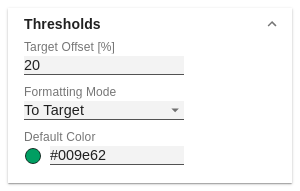 Image Added Image Added
|
LabelsUse the checkboxes to control which labels are to be displayed.
| 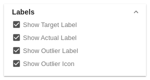 Image Added Image Added
|
BarBar WidthEnter the total width of the bar in % or px herepx, em, rem or %. Bar heightThe Enter the height of the bar can , also be specified in % or pxin px, em, rem or %. | LabelsControl which labels are to be displayed here. |
| TitleActivate the checkbox to add a title to the module. This can be formatted with html tags. | 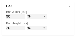 Image Added Image Added
|
FontSizeAffects all font sizes labels in the module. FamilyThe font can be selected here. If this is not available on the system, it will be replaced by one from the same font family.
| 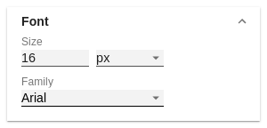 Image Added Image Added
|
ColorsColor of barBar-backgroundBackgroundSets the bar color for the area after the measure bar. Color for errorsErrorsSet the color to be displayed for data that is not meaningful in this context. | TargetEnable Target IndicatorActivate or deactivate the target value indicator. This is activated by default. Color of IndicatorSets the color of the indicator. Indicator Border WidthSet the line width of the indicator here. This also influences the size. |
| 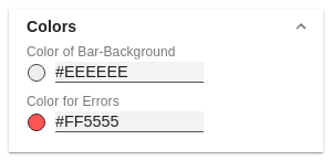 Image Added Image Added
|
Module BackgroundBackground - ColorSet the background color of the module here. |
|