Versions Compared
| Version | Old Version 2 | New Version Current |
|---|---|---|
| Changes made by | ||
| Saved on |
Key
- This line was added.
- This line was removed.
- Formatting was changed.
 Image Removed
You have acquired a data source and now want to depict Data Series with graphomate charts for Lumira.
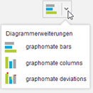
Choose the preferred extension component from chart picker.
Center
 Image Removed
 Image Added
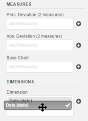
Once you have selected one of our chart components four so-called feeds appear, which can be filled by drag-and-drop with measures and dimensions. These feeds are arranged in the same order as they are presented on the canvas.
The final
feed dimension
is used to select a dimension that applies to both
the Base Chart
as well as
the Deviation
charts. Drag-and-drop one or more dimensions in this feed
Center  Image Added
There are three feeds in Measures category:
- The feed base chart is used to show measures. Simply add measures to the feed via drag-and-drop. Once you have assigned one or more measures, the base chart is drawn. The number of data series, which can be represented in the base chart, is limited to six.
- The feed Abs. Deviation is the basis for the absolute deviation chart, which is drawn above or to the right of the base chart. At this point two key figures must be entered to allow a meaningful deviation to be calculated. The order of the measures in the feed determines the difference calculation using the following formula: 1st measure - 2nd measure

The Feed Perc. Deviation is the basis for the percentage deviation chart. The percent deviation are calculated as follows:
In this way you will get, for example, the following diagram:

The names of the measures and dimensions in the feeds are taken as keys for the axes. We recommend to use the shortest possible names for reasons of space here. Absolute deviations are of course identically scaled to the base chart. Outlier triangles are used to represent very large deviations, if there is not enough space available.