Versions Compared
Key
- This line was added.
- This line was removed.
- Formatting was changed.
Bullet Graphs – the alternative to tachometers and thermometers
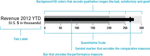
A bullet graph is a variation of a bar graph developed by Stephen Few middle of the last decade. Seemingly inspired by the traditional thermometer charts and progress bars found in many dashboards, the bullet graph serves as a replacement for dashboard gauges and meters. Bullet graphs were developed to overcome the fundamental issues of gauges and meters: they typically display too little information, require too much space, and are cluttered with useless and distracting decoration.
The bullet graph features a single Performance Measure (e.g. current year-to-date revenue), compares that measure to one or more other measures to enrich its meaning (for example, compared to a target), and displays it in the context of Qualitative Ranges of performance, such as poor, satisfactory, and good. The Qualitative Ranges are displayed as varying intensities of a single hue. A quantitative scale and a text label complete the bullet graph.  Image Removed
| Center |
|---|
 Image Added Image Added |
graphomate bullet graphs can be used horizontally and vertically aligned as well as scaled identically. According to the number of dimension members in the query multiple bullet graphs are drawn. A Reverse Quantitative Scale - for example, for costs representations - can be easily realized.
If the Qualitative Ranges are missing in the database, these values can be determined on percentage values based on the Second second Qualitative Range.