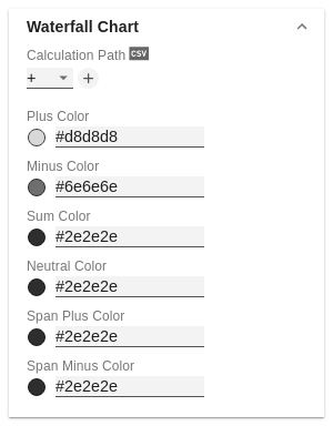
Versions Compared

Key

  • This line was added.
  • This line was removed.
  • Formatting was changed.


Excerpt


Bar Chart

Ending Line Visible

The checkbox (de)activates the ending lines in the bar or column chart.

Ending Line Overlap [px]

The value overlap of the KPI ending lines in [px] right and left above the bar.

Ending Line Thickness

Define the thickness of the ending lines in [px].

Ending Line Color

Specify the color value of the KPI ending lines.

Image Modified

Waterfall Chart

Determine the colors of the waterfall elements - corresponding to the calculation path.

Calculation Path

For the flexible use of the waterfall you store the corresponding arithmetic operation here. By clicking on the csv symbol you can switch between the standard field input or the comma separated input.

possible calculation options:

  • " " does not apply special formatting (space)
  • + Inflow (Plus)
  • - Outflow (Minus)
  • = Subtotals (Sum)
  • "0" neutral position (Neutral)
  • s+ positive margin (Span Plus)
  • s- negative margin (Span Minus)

Waterfall Colors

Set color values for the different calculation options using the Color Picker or a HEX code.

Info

Please note that the use of scenarios overrides this formatting.


Image Modified

Line Chart

Line Dot Radius X

Specify the X-radius in the line chart. The input value can be interpreted as a percentage or absolute value.

Line Dot Radius Y

Specify the Y-radius in the line chart. The input value can be interpreted as a percentage or absolute value.

Line Dot Shape

Select which shape in the line chart is used for a data point

.

The following options are available:circle

  • rect
  • rhomb
  • triangle
  • wedge
  • none
  • Info

    By differentiating between X and Y, ellipses and the like can also be implemented.

    Apply Dot Colors to Lines

    With this setting activated, the color of the heads is also applied to the lines.

    Image Modified

    Pin Chart

    Pin Width

    Define the thickness of the line of pins in pin charts. With Pin Width = "0" you can implement a dot chart. The input value can be interpreted as a percentage or absolute value.

    Pin Head Radius X

    Specify the X-radius in the needle chart. The input value can be interpreted as a percentage or absolute value.

    Pin Head Radius Y

    Specify the Y-radius in the needle chart. The input value can be interpreted as a percentage or absolute value.

    Pin Head Mode

    The setting front (top aligned) draws the needle head in front of the line and concludes above with the value of the respective element value.

    The setting back (center aligned) draws the needle head behind the line and positions the head centered on the respective element value.

    / Top aligned oder Back / Center aligned ; ob der Pinkopf vor der Linie gezeichnet werden soll und ob er mit dem Wert des jeweiligen Elements obig abschließt oder ob der Pinkopf hinter der Linie gezeichnet werden soll und seine Mitte auf Höhe des jeweiligen Elementwertes liegt.

    Pin Head Shape

    Select which shape in the line chart is used for a data point. The following options are available:

    circle

  • rect
  • rhomb
  • triangle
  • wedge
  • none
  • Image Modified

    Stacked Bar Chart

    Controls the mode of the stacked bar charts. The following modes are available:

    • Regular: The totals are formed from the absolute values, i.e. negative values are added up positively.
    • Negative: Negative values are also added up as such. There are also negative stack columns.
    • Negative2: This  mode forms the total sum (similar to Realnumber only without the sum sign), but arranges the elements like negatives. If the total sum is negative, this stands left/bottom at the bar and with positive total sum accordingly right/top.
    • Realnumber: The sums are formed from the real numbers, but only positive stacks are formed.
    • Percent: The stack segments are displayed as percentages of the sum of each stack.

    Stacked Bar Sums Visible

    (De)activates the totals above the stacks. The input value can be interpreted as a percentage or absolute value.

    Stacked Bar Label Position

    Controls whether the labels of the stack are displayed in the middle or on the right.

    Image Modified

    Offsetbar Chart

    Offset bars on left side

    Displays the deviation bars of the offset bar chart on the left instead of the right.

    Deviation Labels On Top

    Always shows the labels of the deviations at the top of the offset bar charts. Otherwise, the negative deviation labels are displayed within the bar.

    Labels on Top

    Shows the labels of the offset bar above the bar and not within it.

    Image Modified