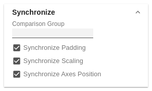
SynchronizeComparison GroupYou can use the Comparison Group to scale several charts identically. When you assign a Comparison Group, Overlay is displayed in the diagram. Comparison Group in Power BI: This function is not supported by Tableau Desktop. Synchronize PaddingSpecifies whether the padding should be taken from the Comparison Group or whether it should be determined independently for the diagram. Synchronize ScalingSpecifies whether the scaling should be taken from the Comparison Group or whether it should be determined independently for the diagram. Synchronize Axes PositionSpecifies whether the axis positions should be taken from the Comparison Group or whether they should be determined independently for the chart. |
|
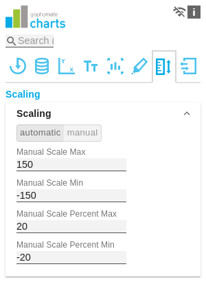
ScalingThe default setting automatic scales the diagram according to the Min and Max values from all data to be displayed. Alternatively, you can manually set min/max scaling values for absolute and percentage values under manual. Chart min values > "0" intersect the value axis. |
|
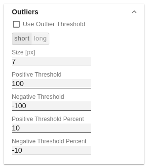
OutliersUse Outlier ThresholdIf the Outliers property is activated, the manually defined value from which outliers are displayed is used. short - longHere you select how outliers are displayed. In short mode, the outliers are displayed as small triangles on the axis. In long mode, however, the outliers are displayed over the entire available area, according to IBCS rules. Size [px]The size of the outlier character in pixels. Negative/Positive ThresholdWith automatic scaling, this is the value up to which everything in the diagram scales automatically. If a value in the data exceeds this limit, this value is not used for the maximum calculation. All values above this value are then displayed accordingly as outliers. Negative/Positive Threshold PercentSame function as Negative/Positive Threshold, but for percentage values in the deviation diagrams. |
|
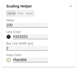
Scaling HelperHere you can activate and define if the Scaling Helper appears as a line or area. ValueEnter the value for the position of the Scaling Helper here. Line ColorUse the Color Picker or a HEX code to define the color of the line (Line Color). Bar Line Width [px]Specify the line width of the Scaling Helper in pixels. Area ColorUse the Color Picker or a HEX code to define the color of the area (Area Color). |
|
Manage space
Manage content
Integrations