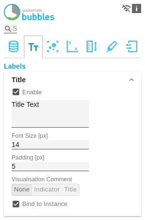
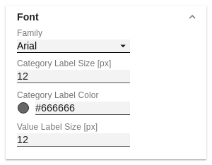
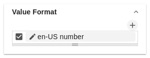
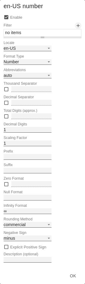
If the Enable checkbox is activated, the title will be displayed. Enter a Title for the bubbles here. Multiline texts will be rendered accordingly, i.e. the line break will be applied. The following HTML tags can be used for formatting: 'b', 'i', 'p', 'span', 'div', 'br', 'h1', 'h2', 'h3', 'h4', 'h5', 'h6', 'hr', 'ol', 'ul', 'li' and 'blockquote'. For the following result this input is necessary: ACME Ltd. Sets the font size of the title in [px]. Set the distance of the title to the diagram in [px] here. Define the global font. You can choose between Arial, Tahoma, Lucida Console, Verdana and Calibri or type in the name of a font which is installed on your system. Specify the size of the Category Labels in [px] here. Select the color for the Category Label using the color picker or by entering the HEX code. Specify the size of the axis and element labels in [px] here. With the Value Format you define the way the values are displayed in the bubble chart. You access the configuration by clicking on an element in the list. You can create and define additional formats using the + symbol. Multiple Value Format Rules (Assignments) are prioritized in descending order, i.e. definitions that are lower in the list overwrite those above them when there filters overlap. Therefore, the generally valid format of the bubbles labels should be defined at the top of this list without any further filters. Value Formats defined below, restricted by filters, overwrite the formatting defined above - "From General to Special". Define the number format using the following options: For the Format Type Time, a system of units can be configured with the help of the Time Units Property, which in the default setting consists of hours and minutes. Each number formatted in this way is then splitted in its values for each unit. The order of the unit list defines their relationship from the largest unit (top) to the smallest unit (bottom). Each unit contains the following options: If the checkbox is activated, a legend is displayed if data has been selected for one of the fields Circle, Arc or Deviation. If the tooltip is activated, the data of the respective bubble is displayed when hovering on element. In Power BI the activation of the tooltips of the graphomate bubbles is done as the following: In Power BI, in the Visualization pane, go to the Format (Formatting, paint roller symbol) symbol and choose the Quick Info option. Switches the Circle Labels permanently on (Always), off (Never) or leaves the decision to the collision logic (Auto). In Auto mode, Circle Labels are hidden in case of collision. Circle Labels have higher priority than Value Labels, but lower priority than Category Labels or other bubbles. This order is applied accordingly in the collision logic. Defines whether the values of the deviations and arc segments should be displayed. Switches the Category Labels permanently on (Always), off (Never) or leaves the decision to the collision logic (Auto). In Auto mode, Circle Labels are hidden in case of collision. Circle Labels have higher priority than Value Labels, but lower priority than Category Labels or other bubbles. This order is applied accordingly in the collision logic. Sets whether the Axis Labels are displayed or hidden. Label visibility priority (from high to low) for collisions: At this point, strings can be assigned for the data series. The checkboxes activate the manually set label, otherwise the automatically generated labels are used. The Manual Series Labels are also used for the legend.Title
Titel Text
ACME Ltd.
Portfolio by Segment
2021
<b>Portfolio</b> by <i>Segment</i>
2021Font Size
Padding
Font
Family
Category Labels Size [px]
Category Label Color
Value Label Size [px]
Value Format
Value Format Pop-Up
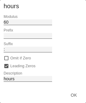
Time Units Pop-Up
Additional Information
Legend
Tooltip

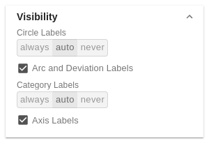
Visibility
Circle Labels
Arc and Deviation Labels
Category Labels
Axis Labels
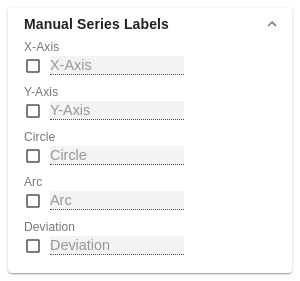
Manual Series Labels
Manage space
Manage content
Integrations