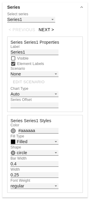
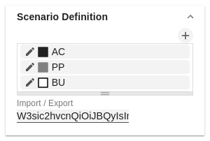
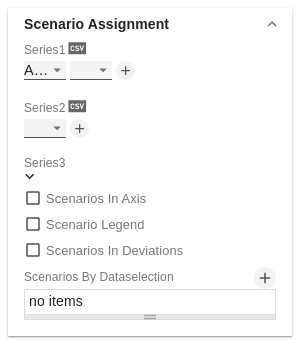
Scenario Assignment
The scenarios can be assigned in two ways:
- Scenario per element of a series (Scenarios 1, Scenarios 2 etc.)
- A field represents one element of the selected series. As soon as the abbreviation of the scenario is entered in a field, the series is extended by one field.
- Alternatively, you can click on the csv button to enter the input using a comma-separated character string (Example: AC,AC,AC,FC,FC,BU).
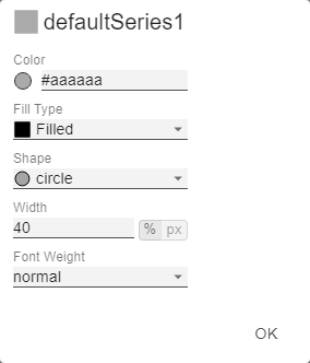
- Scenarios by Series
- A line corresponds to a series. Enter a data abbreviation that is used for the entire series.
- The + symbol can be used to assign further fields (or series) with a data abbreviation.
- Scenarios by Dataselection
- Define which data is assigned to which scenario.
| Info |
|---|
The scenarios are applied in the following order of precedence: - Scenarios per element of a series
- Scenarios by Series vor
- Scenarios by Dataselection
|
Scenarios In Axis
If the checkbox is activated, the scenarios of the first data series are displayed in the axes if Axis Thickness is greater than or equal to 3 [px].
Scenario Legend
If the checkbox is activated, a legend with the respective scenarios is displayed in the diagram. These can be changed later directly in the diagram by the user via a dropdown menu.
| Info |
|---|
The scenario legend is only functional in connection with the property "Scenarios by Series". |
Scenarios In Deviations
If the checkbox is activated, the scenarios are shown in the deviations.
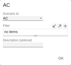
Scenarios by Dataselection
This property determines which data is assigned to which scenario.
Each configuration has the following properties:
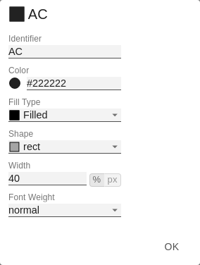
- Scenario Id: The ID of the scenario to be used. A scenario ID used here, has to be defined in the scenario definition.
- Filter: The selected scenario is assigned for each dimension member that is selected here using the
 Image Modified sign.
 - Description: Short name describing the configuration to be recognizable.