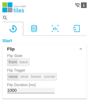
Versions Compared

Key

  • This line was added.
  • This line was removed.
  • Formatting was changed.


Excerpt


Flip

This section allows you to configure the flip animation of the tile.

Flip State

The flip state is used to configure the modules on the front or back side of the tile.

Flip Trigger

Define how the flip effect should be triggered:

  • none: The tile does not turn.
  • click: The tile rotates flips as soon as the tile area is clicked.
  • hover: The tile flips as soon as the mouse pointer is moved over the tile.
  • corner: The tile has a small arrow in the lower right corner to flip it.

Flip Duration

Flip Duration controls the duration of the animation. The specification is in millliseconds, i.e. an input of 1000 results in an animation duration of one second.

Layout

Tile Spacing

Define here the distance between the border tile and the modules amongst each other. Specification in pixels.

Background Color

Define the color value for the background of the tile here.

Border Thickness

Set the thickness of the border lines of the tile here. The setting is in pixels.

Border Color

Specify here the color value for the border line of the tile.

Divider Visibility

Here you can define which divider lines are displayed on the tile. The following modes are available:

  • Horizontal: Display of all horizontal dividing lines.
  • Vertical: Display of all vertically running dividing lines
  • Both: Shows all dividing lines.

Divider Thickness

Set the thickness of the divider lines on the tile here.

Divider Color

Define the color value for the separator lines on the tile here.

Scritpted Formatting

Create a new configuration with the + icon. Insert CSS scripts here to influence the styling of various elements.

Image Added

Data Selection

The checkbox is used to control whether aggregations are displayed in line charts.

Image Added