en GPS Tab1 Start (tiles)
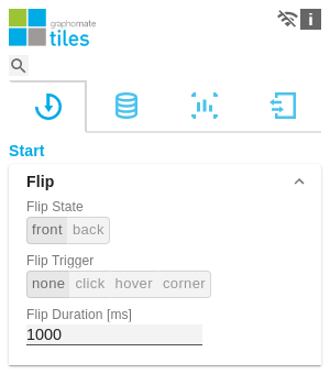
FlipThis section allows you to configure the flip animation of the tile. Flip StateThe flip state is used to configure the modules on the front or back side of the tile. Flip TriggerDefine how the flip effect should be triggered:
Flip DurationFlip Duration controls the duration of the animation. The specification is in millliseconds, i.e. an input of 1000 results in an animation duration of one second. | |
LayoutTile SpacingDefine here the distance between the border tile and the modules amongst each other. Specification in pixels. Background ColorDefine the color value for the background of the tile here. Border ThicknessSet the thickness of the border lines of the tile here. The setting is in pixels. Border ColorSpecify here the color value for the border line of the tile. Divider VisibilityHere you can define which divider lines are displayed on the tile. The following modes are available:
Divider ThicknessSet the thickness of the divider lines on the tile here. Divider ColorDefine the color value for the separator lines on the tile here. | |
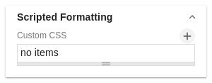
Scritpted FormattingCreate a new configuration with the + icon. Insert CSS scripts here to influence the styling of various elements. | |
Data SelectionThe checkbox is used to control whether aggregations are displayed in line charts. |


