Interactivity at Runtime
- Stefanie Schröder (Unlicensed)
- Tomke Reibisch (Unlicensed)
In its versatility lies the strength of the graphomate trellis, which enabled the end user to analyze your business data according to their questions and problems.
Wizard
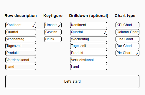
Using the wizard you can quickly build your own starting configuration, which you can then refine according to your questions and requirements. For this you can use the four following settings:
- Row Description: This is the row drilldown. For every member in the selected dimension the graphomate trellis will yield one row, i.e. one module instance.
- Keyfigure: The keyfigure to be used by your first module.
- Chart Type: The starting modules chart type. Please read on for further information about the chart types.
- Drilldown: Some chart types are able to visualize an optional module drill down which is used in this module in every row. Right now all modules can display this, except the KPI module.
Overview
After choosing your starting configuration you will be presented the first complete visualization if the graphomate trellis. The overall structure should become using the for sections marked in the following screenshot:
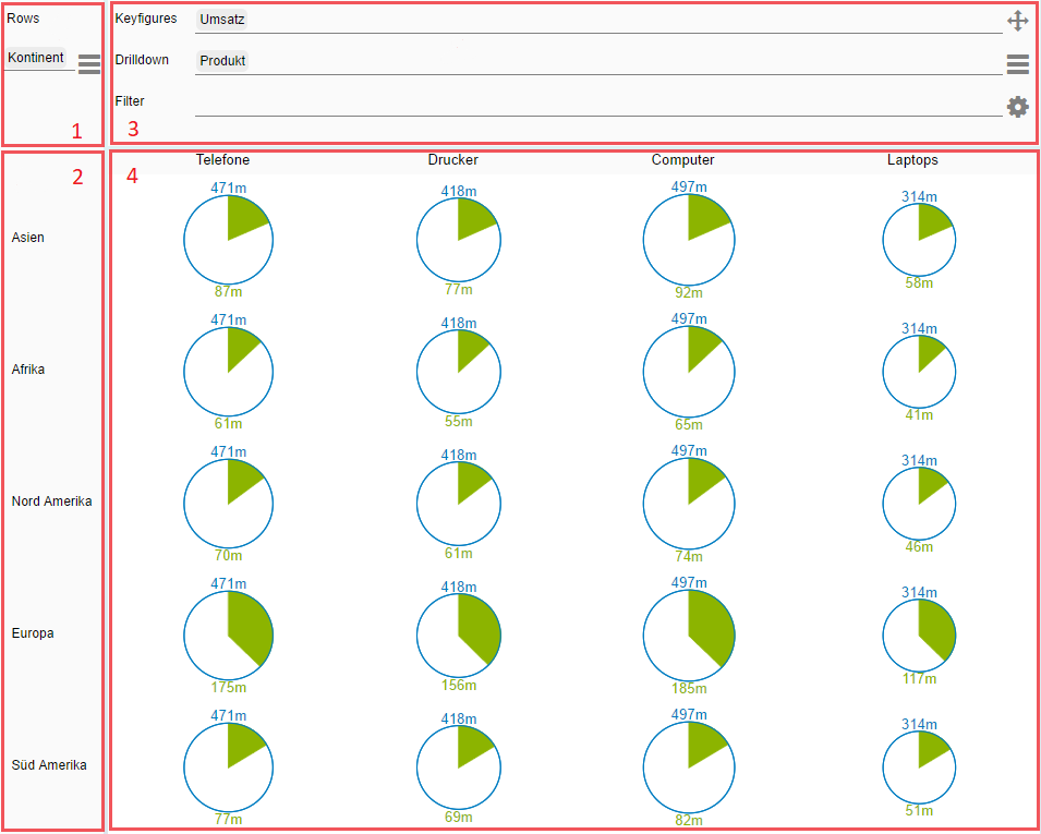
(1)
The first columns header holds the information for the current row description. This sets the members used to display each row. For this you can use whole dimensions or single members. Please open the dimension menu and drag & drop whole dimensions into the designated drop area, or open a member menu by clicking on a single dimension. Members can be set in the same fashion, using drag & drop. The options menu can be used to save or load configurations.
(2)
These are the distinct values of your row description.
(3)
This is the modules header. Keyfugre, drill down und filters are displayed here. The available functionality differs for each chart type:
- Keyfigures: Bar chart, column chart and pie chart each can visualize a single keyfigure. The line chart uses one line for each chosen keyfigure while the KPI chart show either a single keyfigure or the deviation between two keyfigures. The order in which the keyfigures are set specify the order in which numbers are substracted.
- Drill down: Currently all charts have a way to visualize module drill downs, except the KPI chart.
- Filter: This filter is only applied to this module, i.e. this column. As a filter you can specify one or more members. If you pick a whole dimension as your filter it will be dissolved into distinct members.
Using the Icon ![]() you can grab a module and drop it between to other modules to change the horizontal order of your visualizations.
you can grab a module and drop it between to other modules to change the horizontal order of your visualizations.
With the Button ![]() you can open the dimension menu which lets you reach keyfigures, dimensions and members. To open a member menu click on one of the dimensions.
you can open the dimension menu which lets you reach keyfigures, dimensions and members. To open a member menu click on one of the dimensions.
Using the Button ![]() an options menu can be opened. This lets you reach the following settings:
an options menu can be opened. This lets you reach the following settings:
- Duplicate: creates a copy of the current module, which is useful if you only want to change one single aspect. For example, you might want to see if the question at hand could be better answered using the same selections with another chart type.
- Add Module: Adds a new module with a minimal configuration which you can then refine.
- Scale Identically: All modules with this setting activated are considered when scaling your values. This setting is used across the whole component.
In addition you can choose a chart type for this module.
(4)
These are the actual visualizations for your data. Several chart types are possible with their distinct advantages and use cases. Currently these are the available chart types:
- line chart, enables you to compare several keyfigures in one module
- column chart, ideal for temporal data
- bar chart, ideal for structural data
- KPI chart, enables you to visualize deviations
- pie chart, provides a visualization of hierarchies