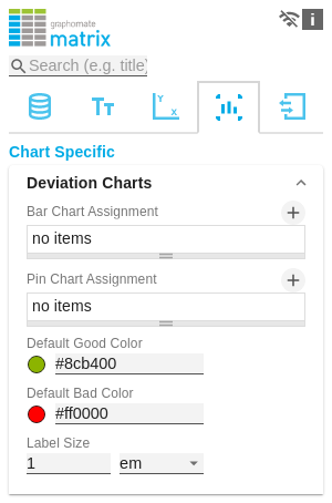
Deviation Charts
In this tab you configure visual elements like bar or pin charts in the graphomate matrix.
Bar Chart Assignment
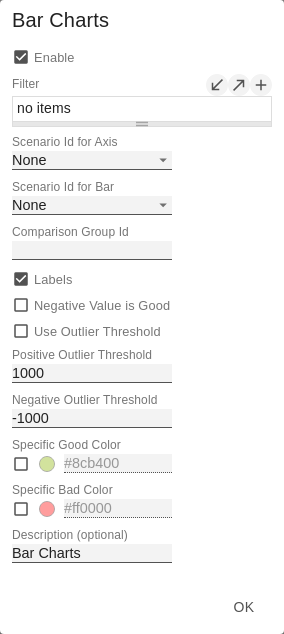
This property determines which data should be displayed as an In-Cell Bar Chart type instead of a number. This can be both source data and calculated measures - tab Data: Calculations. This is a list, whereby each individual list element represents an independent configuration.
Click on the  sign or in the empty list to make settings for the bar charts.
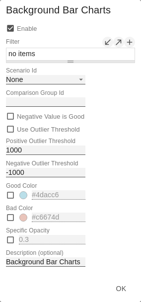
Bar Chart Assignment Pop-Up
- Filter: By clicking in the empty list or on the symbol, you can define one or more dimension members for which the bar charts should be displayed. You could, for example, select the dimension "measures" and the member "Revenue" to display bar charts in all columns representing the measure "Revenue".
- Scenario Id for Axis: Sets a defined scenario for the axis.
- Scenario Id for Bar: Sets a defined scenario for the bar. Scenarios are defined on the first tab Data.
- Comparison Group ID: All In-Cell-Bar Charts of a graphomate matrix with an identical Comparison Group ID - any string - are scaled in the same way.
- Labels: determines whether the value of the cell should be displayed as a label next to the chart's bar.
- Negative Value is Good: To swap the meaning of negative and positive colors, activate this property.
- Use Outlier Threshold: Specify here whether the Outlier Thresholds should be applied to the scaling.
- Positive Outlier Threshold: Describes the upper limit value of the scaling. All values that are greater than this limit value are displayed as outliers and are not included in the scaling. The next lower value of the scale or total scale (if a Comparison Group is used) then determines the new maximum of the scaling.
- Negative Outlier Threshold: Describes the lower limit value of the scaling. All values that are smaller than this limit value are displayed as outliers and are not included in the scaling. The next larger value of the scale or total scale (if a Comparison Group is used) then determines the new minimum of the scaling.
- Use Specific Good Color: If this setting is activated, the general default color value of the deviation charts (Default Good Color) for this bar chart configuration will be overwritten with the value selected in this configuration. Set the color for positively evaluated deviations by clicking on the associated color field using the color picker or as HEX, RGB or HSL code.
- Use Specific Bad Color: If this setting is enabled, the general default color value of the deviation charts (Default Bad Color) for this bar chart configuration will be overwritten with the value selected in this configuration. Set the color for negatively evaluated deviations by clicking on the associated color field using the color picker or as HEX, RGB or HSL code.
- Description: Short name that describes the configuration to be recognizable.
Pin Chart Assignment
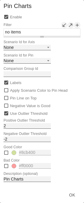
This property determines which data should be displayed as an In-Cell Pin Chart type instead of a number. This can be both source data and calculated measures - tab Data: Calculations. This is a list, whereby each individual list element represents an independent configuration.
Click on the sign or in the empty list to make settings for the pin charts.
Pin Chart Assignment Pop-Up
- Filter(optional, Pop-Up): By clicking in the empty list or on the symbol, you can define one or more dimension members for which the pin charts should be displayed. You could, for example, select the dimension "measures" and the member "Revenue" to display pin charts in all columns representing the measure "Revenue".
- Scenario Id for Axis: Sets a defined scenario for the axis.
- Scenario Id for Pin: Sets a defined scenario for the pin. Scenarios are defined on the first tab Data.
- Comparison Group ID: All In-Cell-Pin Charts of a graphomate matrix with an identical Comparison Group ID - any string - are scaled in the same way. In a later release this will also be possible across multiple graphomate matrix instances.
- Labels: determines whether the value of the cell should be displayed as a label next to the chart`s pin.
- Apply Scenario Color to Pin Head: If this setting is activated, the color of the defined scenario is used for the pin head.
- Pin Line on Top: Displays the line of the needle in the foreground (in front of the needle head).
- Negative Value is Good: To swap the meaning of negative and positive colors, activate this property.
- Use Outlier Threshold: Specify here whether the Outlier Thresholds should be applied to the scaling.
- Positive Outlier Threshold: Describes the upper limit value of the scaling. All values that are greater than this limit value are displayed as outliers and are not included in the scaling. The next lower value of the scale or total scale (if a Comparison Group is used) then determines the new maximum of the scaling.
- Negative Outlier Threshold: Describes the lower limit value of the scaling. All values that are smaller than this limit value are displayed as outliers and are not included in the scaling. The next larger value of the scale or total scale (if a Comparison Group is used) then determines the new minimum of the scaling.
- Use Specific Good Color: If this setting is activated, the general default color value of the deviation charts (Default Good Color) for this pin chart configuration is overwritten with the value specified in this configuration. Set the color for positively evaluated deviations by clicking on the associated color field using the color picker or as HEX, RGB or HSL code.
- Use Specific Bad Color: If this setting is enabled, the general default color value of the deviation charts (Default Bad Color) for this pin chart configuration will be overwritten with the value specified in this configuration. Set the color for negatively evaluated deviations by clicking on the associated color field using the color picker or as HEX, RGB or HSL code.
- Description: Short name that describes the configuration to be recognizable.
Default Good Color
Here you can set the color for positive connoted values by clicking on the corresponding colored circle to open the color picker.
Default Bad Color
Here you can set the colors for negatively connoted values by clicking on the corresponding colored circle to open the color picker.
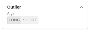
Outlier Style
Here you can select how outliers are displayed. In SHORT mode, the outliers are displayed as small triangles on the axis. In LONG mode, however, the outliers are displayed over the entire available area according to IBCS rules.
Label Size
Enter the size of the font in the deviation charts. Choose a CSS unit (such as px, em) from the list.