...
...
Data Binding
Since the QRC3 release 2022 of SAC, data can be directly linked to our custom widgets. The first step is to assign a Data Model. To do this, click on the  Image Removed-icon on the right and select the data model you want to use.
Measures
Determine which measures should be depicted within the chart.
Categories
Define here which dimension determines the category (X)-axis.
Series
Here you can generate several series of the above selected measure by means of a dimension - according to the characteristics of the dimension. Use this option, for example, to "break down" the key figure "Sales" according to actual and planned values by entering the dimension for scenarios here.
The chart shows two series accordingly.
Filter
You can define (background) filters for dimension values here.
Variables
At this point you transfer values for variables.
...
Small Multiples
To display so-called "small multiples" use the following options.:
Split Dimension
| Excerpt |
|---|
Small MultiplesTo display so-called "small multiples" use the following options.: Split DimensionDetermine which dimension should be used as the split dimension for the calculation of the small multiples. - Power BI: The Small Multiples Dimension option can be found in the Visualization Pane under Values fields.
- SAP Analytics Cloud: Dimension, whose member is used to calculate the small multiples.
- Tableau: Dimension over whose member the small multiples are calculated.
N CountDefines the number of charts to be displayed before the 'Rest' position. | Info |
|---|
- The N Small Multiples before the 'Rest' position are sorted in descending order according to their respective totals starting with the largest Small Multiple.
- If the number N exceeds the number of existing members of the split dimension, no 'Rest' position can be formed. However, the descending sorting remains.
- If the N Count is set to "0" or "none", the order of the small multiples corresponds to the order of the split dimension members from the data source.
|
Min Width [px]Defines the minimum width of each small multiple chart. Min Height [ |
px]Defines the minimum height of each small multiple chartpx]Defines the minimum height of each small multiple chart.
| Info |
|---|
If a split dimension is set, the option "Crop Category Labels" is activated and the respective member of the split dimension is displayed as the title regardless of the selected settings in the graphomate property sheet. |
|  Image Modified Image Modified
| N + RestUse this option to restrict the number of members (N + Rest) of a dimension.
You can define one configuration of N + rest for the graphomate charts: - Enable: Applies the N + Rest Confuration, when enabled.
- Mode: Choose between top (Top) and bottom (Bottom).
- Number n of top/bottom members: Define the number of top/bottom elements.
- Target Dimension: The dimension for which the top/bottom members are to be determined - e. g. "Country".
- Target Dimension Subset: Here you have to select the key figure on which base the top/bottom-N members are calculated.
- Rest Member Name (optional): Sets a label for the rest member.
- Description (optional): Defines a description for the set
|
configuration. Image Removed Image Removed
 Image Removed Image Removed
SeriesStylesAt this point you define the styling of a series. Use the Series Style pop-up to define the appearance of the data series, provided you do not use scenarios. Scenarios overwrite the Series Styles. Import/ExportCopy this string to use Series Styles in other graphomate charts components. VisibilitiesUse the checkbox to specify which of the series should be visible in the chart. Element OffsetThe Element Offset parameter determines the displacement of the elements on the category axis relative to each other. This can be specified in percent or absolute in [px] using the switch. Negative values can also be used for displacement in the opposite direction. Offset per SeriesDer Offset kann hier pro Serie festgelegt werden. Series Style Pop-Up | Image Added Image Added
| SeriesWe have summarised the settings for series styling in a clearer way.
First select the data series for which you want to make settings in the drop-down box. Series Series1 PropertiesHere you define the properties per series - jump between series with <PREVIOUS NEXT>. - Label: Name of the series.
- Visible: Visibility of the data series in the chart.
- Element Labels: Switch for the visibility of the Value Labels.
- Scenario: Assignment of a scenario for an entire series.
The EDIT SCENARIO button takes you to the definition menu for scenarios. - Chart Type: Selection of the chart type for the series.
This allows for combination charts with all chart types. - Series Offset: Use this property to move the position of a series on the category axis. This can be specified as a percentage - values between 0.0 and 1.0 - or as an absolute value in [px].
Negative values can be used for shifting in the opposite direction.
Series Series1 Styles- Color: Define the color using the colorpicker or enter a HEX code here.
- Fill Type: The available Fill patterns are the following: filled(Filled), not filled (Empty), hatching down (Hatched Down), thick hatching down (Hatched Down Bold), hatching up (Hatched Up), thick hatching up (Hatched Up Bold), dotted (Dotted).
- Shape: Refers to the pin heads or line points. The following shapes are available: circle, rectangle, rhomb, wedge, no symbol (none).
- Width: Determines the width of the elements. This can be specified as a percentage of the category width or as an absolute value in [px].
- Font Weight: Choose between normal or bold font size.
| Info |
|---|
Width can only be applied to column and bar charts. |
| 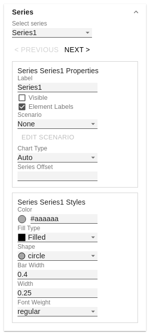 Image Modified Image Modified
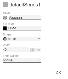 Image Modified Image Modified
| Scenario DefinitionThe list element contains all definitions of scenarios in this diagram. By clicking on the + symbol a new scenario is created. When hovering over a list element, a red trash can appears, which implies that a scenario has been deleted. Import/ExportCopy this string to use scenarios in other graphomate charts components. Scenario Definition Pop-Up- Identifier: Assign a unique abbreviation for the scenario.
- Color: Define the color using the colorpicker or enter a HEX code.
- Fill Type: The available Fill patterns are the following: filled(Filled), not filled (Empty), hatching down (Hatched Down), thick hatching down (Hatched Down Bold), hatching up (Hatched Up), thick hatching up (Hatched Up Bold), dotted (Dotted).
- Shape: Refers to the pin heads or line points. The following shapes are available: circle, rectangle, rhomb, wedge, no symbol (none).
- Width: Determines the width of the elements. This can be specified as a percentage of the category width or as an absolute value in [px].
- Font Weight: Choose between normal or bold font size.
| 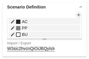 Image Modified Image Modified
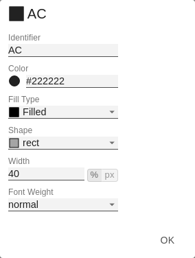 Image Modified Image Modified
| Scenario AssignmentThe scenarios can be assigned in two ways: - Scenario per element of a series (Scenarios 1, Scenarios 2 etc.)
- A field represents one element of the selected series. As soon as the abbreviation of the scenario is entered in a field, the series is extended by one field.
- Alternatively, you can click on the csv button to enter the input using a comma-separated character string (Example: AC,AC,AC,FC,FC,BU).
- Scenarios by Series
- A line corresponds to a series. Enter a data abbreviation that is used for the entire series.
- The + symbol can be used to assign further fields (or series) with a data abbreviation.
- Scenarios by Dataselection
- Define which data is assigned to which scenario.
| Info |
|---|
The scenarios are applied in the following order of precedence: - Scenarios per element of a series
- Scenarios by Series vor
- Scenarios by Dataselection
|
Scenarios In AxisIf the checkbox is activated, the scenarios of the first data series are displayed in the axes if Axis Thickness is greater than or equal to 3 [px]. Scenario Legend If the checkbox is activated, a legend with the respective scenarios is displayed in the diagram. These can be changed later directly in the diagram by the user via a dropdown menu. | Info |
|---|
The scenario legend is only functional in connection with the property "Scenarios by Series". |
Scenarios In DeviationsIf the checkbox is activated, the scenarios are shown in the deviations. Scenarios by DataselectionThis property determines which data is assigned to which scenario. Each configuration has the following properties: - Scenario Id: The ID of the scenario to be used. A scenario ID used here, has to be defined in the scenario definition.
- Filter: The selected scenario is assigned for each dimension member
|
that is selected here using the  Image Removed sign.Description: Short name describing the configuration to be recognizable. Image Removed sign.Description: Short name describing the configuration to be recognizable.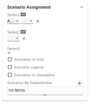 Image Removed Image Removed
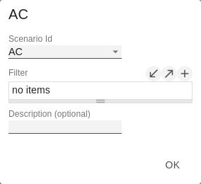 Image Removed Image Removed
| SelectionFade Out OpacityThis value determines to what extent chart elements should be hidden that are not selected. The value starts at 0.0 (completely hidden) and goes up to 1.0 (completely visible). | 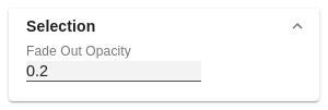 Image Removed Image Removed- that is selected here using the Image Added sign.
- Description: Short name describing the configuration to be recognizable.
| Image Added Image Added | SelectionFade Out OpacityThis value determines to what extent chart elements should be hidden that are not selected. The value starts at 0.0 (completely hidden) and goes up to 1.0 (completely visible). | Image Added | SAC Data BindingData Source TypeSince we introduced the graphomate shared datasource, you have the option to either directly bind a SAC model or use the shared source. Measure Dimension in RowsIf this checkbox is activated, measure names are used for the categories. This is useful, for example, if only key figures are displayed in a chart. Set VariablesThis is where you pass values for variables. Use Runtime DataIf this checkbox is activated, data from SAC standard components can still be used as a data source for the graphomate charts via scripting. | 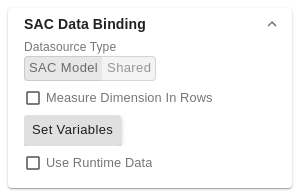 Image Added Image Added
|
|