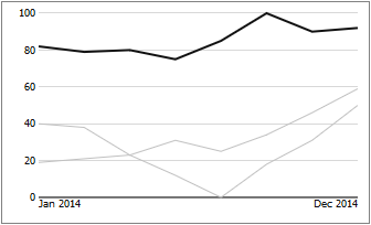
Description of Sparkline Elements
- Konradin Schoemers (Unlicensed)
- Stefanie Schröder (Unlicensed)
- Jens Beckmann (Unlicensed)
The elements of a single sparkline are broken down in the following: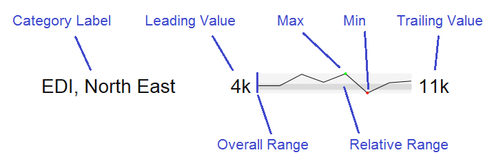
The Category Label is generated from the data dimensions.
Leading Value is the first value in the data of a single sparkline.
Trailing Value is the last value in the data of a single sparkline.
Max / Min represent the largest respectively smallest value in the data of a single sparkline; visualized by a small colored dot (by default and green or red).
The Overall Range depicts the overall extent of all values from the resultset; the Relative Range marks the range of an individual sparkline within the Overall Range.
Example: the resultset contains two records. The maximum of the first records amounts to 100, the minimum to 75; the values of record 2 range between 0 and 50. In this case, the Overall Range for the component is 0-100. The Relative Range for record 1 is displayed in the upper quarter of the Overall Range, while the Relative Range for record 2 is displayed in the lower half.
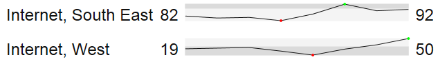
With this, it is possible to estimate the relevancy of a sparkline within the overall data set with a single glance; the higher the Relative Range is positioned within the Overall Range, the higher are the underlying values. Furthermore, it becomes evident quite quickly how diverse the values are – a wide bar represents a broad distribution, whereas in a narrower bar, values deviate far less.
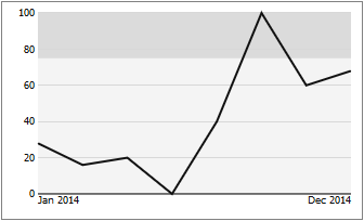
This is supported by an animated zoom: if the appropriate options are activated, a click on a sparkline will open an animated zoom popup.
The animation is divided into three steps:
1. In the first step, the clicked sparkline including Relative Range and Overall Range is enlarged to completely fill the zoom window.
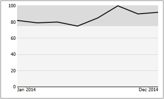
2. In the second step, the sparkline itself is narrowed into the Relative Range, so that it is now scaled absolutely.
3. In a third step, Overall Range and Relative Range are faded out, and all other series from the dataset are faded in, so that the clicked sparkline can now be viewed in an absolute context together with all other other data series. The clicked sparkline is displayed in a different color than the others to ensure discriminability.
When hovering over a line with the mouse, it is highlighted in color; furthermore, a tooltip containing additionial information is displayed.