- Created by Gregor Große-Bölting , last modified by Tim Schauder on Aug 19, 2019
You are viewing an old version of this content. View the current version.
Compare with Current View Version History
« Previous Version 46 Next »
Basically, there are two possibilities to maintain the features of graphomate tables: with the Standard Properties Sheet, which lists all parameters in a structured list or with the Additional Properties Sheet. The latter provides a user-friendly interface. There are some special features, which can only be maintained on the Standard Properties Sheet.
The Checkboxes  next to the features in the Additional Properties Sheet are used to control the visibility of elements.
The chosen Data Source can only be attributed to the component via drag&drop or via the Standard Properties Sheet under Data Binding.
Clicking the F5 key reinitializes the canvas as well as the Additional Properties Sheet. This is sometimes necessary when changes in the Properties are not directly accepted in the canvas.
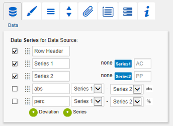
Data TabData SeriesHere you can link up to 32 Data Series from the Data Source that you want to display by clicking the corresponding button and then choosing a column or row in the following window. The Checkbox next to the Deviation/Series determines its visibility in the table. Change the name of the Deviation/Series by clicking on it. The given names are used as column headers in the table. Use the input field following the series selection button to enter a Data Type for the Data Series. The selected Data Type will be displayed as a bar beneath the corresponding column header (styled as configured on the tab Data Types). Specified data types are internally converted to capital letters to eliminate problems with faulty inputs. It’s possible to visualize deviations of two Data Series within the graphomate tables with so called micro charts. The deviation configuration is integrated in this tab: Use the dropdown boxes to choose Data Series for the calculation of deviations according to the formulas on the right. Click the button abs/% to select absolute – visualized by bars – and percentage deviation – visualized by pins. If display attributes are added in the initial view these are automatically inserted as additional columns in the table (between the row titles and the actual data). The heading of the attribute column is then the attribute dimension. Showing and hiding the attributes is only possible in the initial view. The micro charts in deviation columns are formatted automatically according to the chosen Data Type: bar and pin elements use the Data Type of DataSeries1/ACT, the axis – if Semantic Axis is activated on the Helper tab – uses the Data Type of DataSeries2/BUD. By clicking the green buttons you are able to add a new Deviation Series or a new Data Series. By clicking the red button which appears behind each series while hovering over the line, the according series is deleted. Series 1 and 2 are not removed by clicking the delete button, but only cleared in order to assign a new Data Series. With the dotted area in front of each line you can drag and drop the according data assignment to a new position. The resulting order is used as a column layout for the table. The row headers can be moved to any position within the table in this way and enable so-called butterfly tables. The visibility of the row titles can be set in the same way as the series and deviations via the checkbox. The position of the attribute columns can currently only be set via the Column Order property in the standard properties. However, as soon as a setting is made in the default properties, it is overwritten by loading or changing the Additional Properties Sheet. TitleEnter a title for your table at this point. If the Checkbox is activated, the title will be shown. Line breaks are adopted. |
|
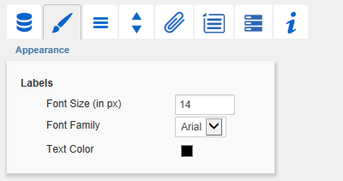
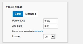
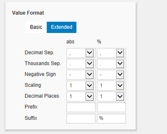
Appearance TabLabelsSelect the appearance of the font of the table. Font SizeSets the font size. The font size influences implicitly the dimensioning of the table. Therefore parameters are specified in the unit "fs" (font size) in order to be dependent on the font size. Some of these parameter values can be maintained via the Standard Properties Sheet. Font FamilySets the font family. Choose between Arial, Lucida Console, Tahoma and Verdana via the drop-down box. Text ColorSets the color of the text (including the title text). If a hierarchy is used within the table, the color defined in the section Hierarchy Nodes (or by the Property Node Style Color) is set for those elements. If a Data Type is assigned to a column and the option Apply Data Types to Cells (in the section Columns) activated, the specified color of the corresponding Data Type is applied for the entire column and thus overrules the text color that is specified here. Value FormatSelect the format of the table values:
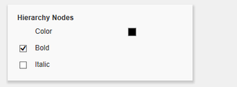
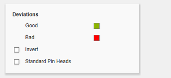
Set the Use Formatted Data property in the Standard Properties Sheet to "true" if you want to show the data according to format of the Data Source. Hierarchy NodesHere you can control Color and font style of the Hierarchy Nodes in the table. The color overrules the font color set in the section Text Color. ColumnsData Types in Header activates bars in the column headers showing the Data Type. Apply Data Types to Cells sets the color of the corresponding Data Type for the whole column and overrules all other color settings. RowsRow headers of the first column can be aligned to the right by activating the Checkbox Title Alignment Right. DeviationsSet the colors for deviations. If positive deviations between values are not regarded as positive, for example for comparisons of actual vs. budget costs, activate the Checkbox Invert. With the option Standard Pin Heads, the pin heads of the percentage deviations are displayed the legacy way or according to the IBCS. Outlier ModeChoose the appearance of the outliers here. In the mode Short the outliers are shown as small triangles on the axis. In the mode Long they are drawn over the entire available area – according to the rules by IBCS. |
 |
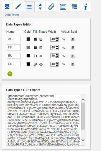
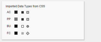
Data Types TabData Types EditorThis editor is used to define Data Types. The abbreviations can be used on the Data Tab and it is possible to format each element individually. The abbreviations are defined in the column Name. The entered Data Types are automatically converted to uppercase. Color and Fill define the appearance of the elements. Shape changes the appearance of the pin heads of the deviation charts. Navigate via mouse click through the alternative representations and view the changes in the column headers, after you assigned the corresponding Data Type. Width determines the width of the elements and is specified in percentage of the font size. The toggle button %/abs has no effect on the tables. Bold sets the font type of the column header to bold if a Data Type is assigned. With the red button next to Data Type you delete Data Types and with the green one you add new Data Types. Please note that Data Types are used globally within the BIApp. Data Types for the graphomate tables component, will automatically be adopted for all other graphomate components, that allow for Data Types. Data Types CSS ExportIf you want to store the defined Data Types in a central location, you can extend your central CSS Stylesheet on the BI Platform accordingly. Just copy the code in the box to the end of your CSS file. Now it is no longer possible to use own Data Types because the central settings are displayed as shown in the example on the right. |
|
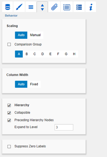
Behavior TabScalingThe default Auto scales the table according to the Min and Max-values of all selected data. The deviation charts of several tables can be scaled identically by using the same Comparison Group, which is activated by the Checkbox. The Comparision Group will then be shown during design time on the top right corner of the table. That way the Min and Max of the data basis in this group is used. Additionally, enabling the Comparison Group of a single table scales deviation charts of that table identically. Comparision Groups are used globally within the BIApp, i. e. also charts in the graphomate charts are scaled identically by using the same Comparison Group abbreviation. Alternatively it is possible to set the Min and Max scaling values under Manual. Chart Min values > “0” cut the value axis. Retrieve values proposes valid values! Column Width
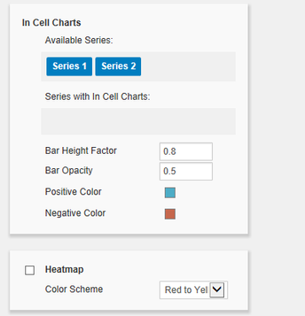
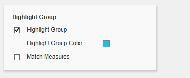
Use the property Width Per Column in the Standard Properties Sheet to set the width of each column independently. HierarchyActivate the Checkbox Hierarchy to show the hierarchical order of the dimension. If you want to drilldown and roll-up within the hierarchy during runtime, activate the Checkbox Collapsible. Preceding Hierarchy Nodes controls the position of the totals in the table: above or below the table values. Expand to Level determine up to which hierarchy level the hierarchy is to be expanded in the start drilldown (starting with level 0). It’s imperative that external BW-hierarchies used in a Data Source are fully expanded, and all (sub-)totals are displayed. Failure to do so may result in misstatements! Suppress Zero LabelsIf the Checkbox is activated, all zero values are hidden – both in the table itself and in the deviation charts. In Cell ChartsUse drag-and-drop to move the desired series from Available Series to Series with In Cell Charts so that bar graphs are displayed in the corresponding columns to visualize the value. Positive values are colored according to the Positive Color, negative values corresponding to the Negative Color. The bars are provided with a transparency. The strength of the transparency can be influenced by the Bar Opacity (values between 0 and 1 are possible). In addition, you can adjust the height of the bars in relation to the size of the table cell using the Bar Height Factor (values between 0 and 1 are possible). HeatmapIf this option is activated, the value columns of the table are displayed as heat maps, i. e. with a colored background. For this purpose, all values of the table are mapped to a color scale, which can be set under Color Scheme. In addition, all color scales defined via ColorBrewer can be realized in the Standard Properties. The definition of a color scheme in the Standard Properties Sheet consists of two comma-separated parts: The abbreviated color scale (e.g. YlOrRd for "Yellow to Orange to Red") and the number of gradations. Both the In Cell Charts and the Heatmap can cause the bars of different columns to overlap. If this is the case, this is probably due to the fact that the width of the columns has been configured too small. Please check whether an enlargement of the column width (in particular the line title) causes the overlap to disappear. Highlight GroupActivate the Highlight Group to match corressponding bubbles. For detailed information see Runtime Interactivity. |
|
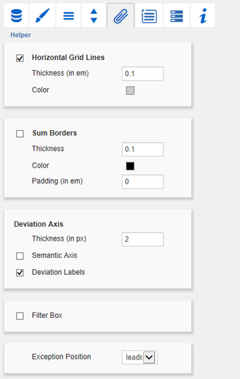
Helper TabHorizontal Grid LinesActivate the Checkbox Horizontal Grid Lines to display these. Set the Thickness and Color of the grid lines with the following two parameters. Sum BordersActivate the Checkbox in order to display the Sum Borders. You can specify the Thickness and Color of the Sum Borders. With Padding a distance between the sums and the child elements is added. We recommend to deactivate the option Preceding Hierarchy Nodes (see Behavior Tab) when using the Sum Borders, so that the sums of elements are listed below the values. Deviation AxisIn this section adjustments to the Deviation Axis can be done. You can specify the Thickness of the Deviation Axis. Semantic Axis enables to draw the deviation axis in accordance with the Data Type associated to Data Series2. The Checkbox in front of Deviation Labels controls whether the textual values should be displayed. If this option is deactivated, there are only graphical bars. Filter BoxIn the top left cell of the first row of the graphomate tables we implemented a filter function. Activate the Checkbox Filter Box to make the Filter Box visible for the users. Just enter some letters or regular expressions in the Filter Box and only those table rows are shown that contain these letters. Upper and lower case is not considered. Exception PositionException Position describes where the exceptions are displayed in the table. The conditions for displaying exceptions can be configured via the following Row Format Configuration. Selectable positions are: at the beginning of the cell (leading), before or after the value. |
|
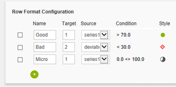
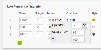
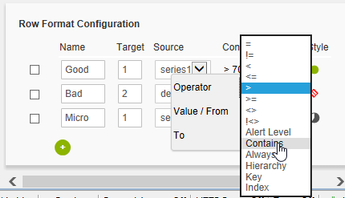
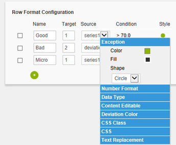
Row Format ConfigurationThe Row Format Cofiguration enables detailed layouting of rows and columns. This new layouting feature replaces the Exception Configuration, which could have been found at the same position in previous versions. The Exceptions are now just one of many styles (see below) provided by the Row Format Configuration. The Checkboxes in front activate the visibility of each Configuration. Enter a Name for the special Row Format Configuration in the next column. As it will be used internally and for the scripting language you should choose a unique name. Target determines the target column in which the Row Format Configuration should be displayed. Target refers to the index of the column (Target 0 describes the first column containing the row titles). Apart from setting a single column you can even chose more columns as Target for the used Style. There are two other methods to set a range of columns: The keyword all is used to pick all columns. The second way is to enter a list of explicit column indices separated by comma (e.g. 2,3). As there are some Styles which are not applied to all columns, please see below if the chosen Style does support layouting all columns. The Source column is used to calculate or check the chosen Condition. You can pick a column using a single index. Unlike in older versions you can now also choose columns containing titles, attribute or deviations as Source column. To specify the conditions that lead to the display of an Row Format click on the value under the heading Condition. Select the condition by choosing an Operator and a span. When applying comparison operators to data cells, the underlying numerical value is always considered, never the formatted string. For percentage deviations, it is the converted decimal value (50% corresponds to 0.5). In addition to the usual mathmatical operators for value comparisons, a few other options are available:
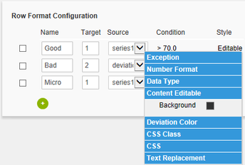
This Condition together with the Source cell is used to restrict the layouting of the Target cell, so it directly controls if the Style is applied or not. In order to define the Style of an Row Format Configuration click on the icon under the heading Style and choose between: Exception, Number Format, Data Type, Content Editable, Deviation Color, CSS Class or CSS.
With the red button you delete Row Formats and with the green one you add new ones. |
|
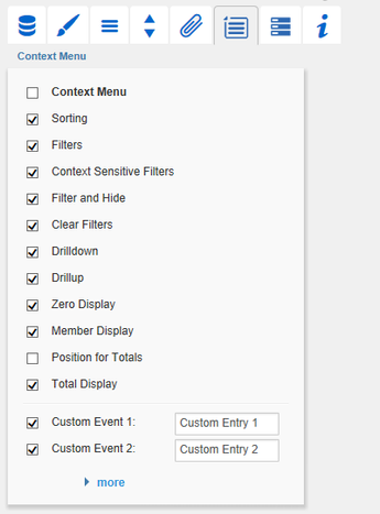
Context Menu TabIn this tab you will be able to choose which options are available in the context menu. An activated checkbox means this options will be shown. The first checkbox enables or disables the context menu altogether. Once activated the context menu will be accessible during runtime by right clicking on the component. The active operations will be usable as follows. SortingWith Sorting data from the available dimensions can be sorted in ascending or descending order. FiltersAllows you to filter the data by member for all available dimensions. Context Sensitive FiltersShows filters corresponding to the currently clicked dimension. Filter and HideIn addition to the normal filtering this operation also removes the corresponding dimension from our initial view. Clear FiltersResets previously set filters. DrilldownAdds another dimension to the component. DrillupRemoves a dimension from the chart (this can cause an error which makes a reload neccessary). Zero DisplaySets the way zero values are displayed. Member DisplayLets you choose the way member names are displayed (text or key). Position For TotalsIs disabled by default, since this option has no effect on the graphomate tables. Also activating the option has no effect. Position For Totals affects only the graphomate charts. Total DisplayEnable or disable totals for each dimension. Custom EventsThere are 10 possible events which can be linked to your own scripts. These can be defined in the Standard Properties Sheet and triggered using the corresponding button in the context menu. In the Additional Properties Sheet the names for these buttons is customizable. All operations are executed directly on the data source, but without changing it. A reload resets all changes made with the context menu. |
|
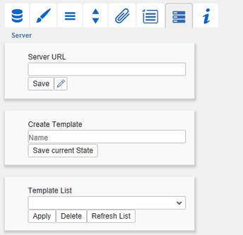
Server TabServer ConfigurationHere you can enter the Server URL to which the component should connect and from which it should retrieve the templates. The hyperlink below the buttons allows you to jump to the admin. Templating ConfigurationIf the current settings are to be saved as a template, a new template name can be entered in the input field with the name Create Template and confirmed by clicking the Save current State button. If the naming convention entered is correct, the template is saved on the server and a toast with the corresponding message is displayed in the lower part of the Additional Property Sheet. However, if the name entered does not meet the expected naming conventions, a toast with the permitted characters is displayed accordingly. Templates stored on the server can be retrieved and applied via the Template List. Just select the desired template and press the Apply button. If you want to delete a template, select the template in the list and press the Delete button. If changes have been made to the templates on the server side, the list must be updated via the Refresh List button. Changes should then be visible. |
|
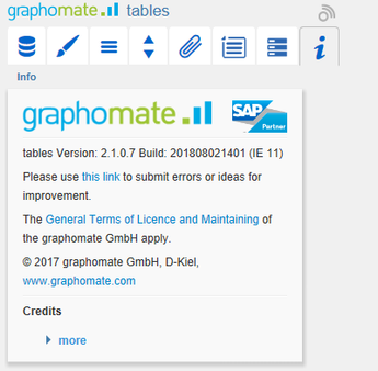
Info TabHere you can find the version number of our graphomate tables as well as a link where you may report bugs or propose wishes for new features. A list of all open-source libraries that we used can be found under Credits. |
|
- No labels
