en GPS Tab3 Labels (charts) SAC
- Alexander Widdecke
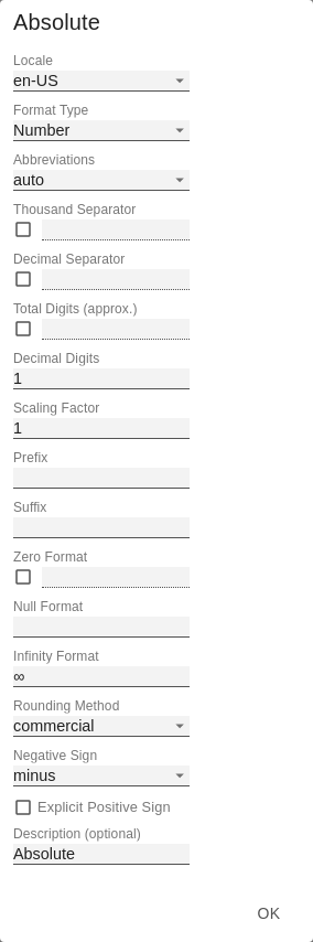
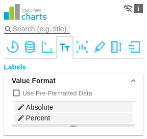
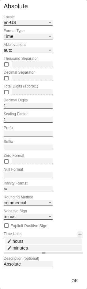
Value FormatWith the Value Format you define the way values are displayed in the diagram. You can access the configuration by clicking on an element in the list. Use Pre-Formatted DataIf this option is activated, the number formatting of the data source is used. Value Format Pop-UpDefine the number format using the following options:
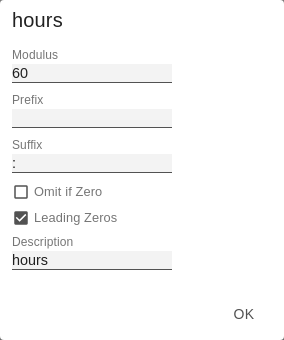
Time Units Pop UpFor the Format Type Time, a system of units can be configured with the help of the Time Units Property, which in the default setting consists of hours and minutes. Each number formatted in this way is then splitted in its values for each unit. The order of the unit list defines their relationship from the largest unit (top) to the smallest unit (bottom). Each unit contains the following options:
|
|
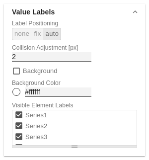
Value LabelsLabel PositioningDetermine the mode that controls the data labeling. Three modes are available:
Collision Adjustment [px]Adjusts the collision algorithm of the labels of the auto mode of the value labels. The smaller the value, the more sensitive the algorithm is to collisions. Negative values are also allowed. (Note: Bold labels are not considered by the collision algorithm, so they always appear). BackgroundThis option draws a colored area behind the Value Labels. With Background Color you define the desired color. Background ColorWith Background Color you define the desired color of the area. Visible Element LabelsDefine from which series the element label is visible. |
|
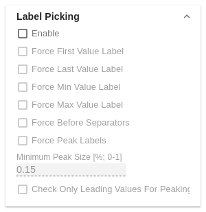
Label PickingIf this option is enabled, you can use the subordinate settings to control which labels are displayed according to certain criteria. Consequently, only those labels that match the selected criteria are displayed. The following options are available: Force First Value LabelThe first label of a series is displayed. Force Last Value LabelThe last label of a series is displayed. Force Min Value LabelThe minimum value of each series is displayed. Force Max Value LabelThe maximum value of each series is displayed. Force Before SeparatorsAll values before a separator are displayed. This option depends on the settings under Separators. Force Peak LabelsThis option displays local minima and maxima. What a local minimum/maximum is can be controlled with the option Minimum Peak Size in %. Minimum Peak Size in %Determines how much values must deviate from their neighbors to be considered a local minimum/maximum. Check Only Leading Values For PeakThe peak calculation only refers to the previous value; the following value is not taken into account. |
|
FontSize [px]This property determines the font size in pixel. FamilyDefine the global font. You can choose between Arial, Tahoma, Lucida Console, Verdana and Calibri or type in the name of a font which is installed on your system. ColorThis property determines the font color as HEX code. Alternatively, the Color Picker can be used. | 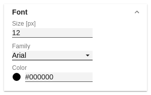 |
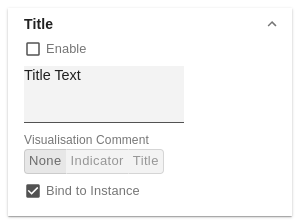
TitleIf the Enable checkbox is activated, the title will be displayed. Title TextEnter a Title for the charts here. Multiline texts will be rendered accordingly, i.e. the line break will be applied. The following HTML tags can be used for formatting: 'b', 'i', 'p', 'span', 'div', 'br', 'h1', 'h2', 'h3', 'h4', 'h5', 'h6', 'hr', 'ol', 'ul', 'li' and 'blockquote'. For the following result this input is necessary: ACME Ltd. Visualization CommentThis property only applies when using our graphomate comments. NoneIf None is selected, no comments are displayed. IndicatorIf Indicator is selected, only a comment icon TitleTitle replaces the title display for this chart completely with the stored comments in the graphomate comments. Bind to instanceThe checkbox forces this title comment to only this chart instance. Other charts with the same data context do not present this comment. |
|
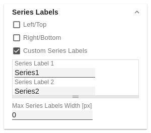
Series LabelsLeft/TopActivate the checkboxes to display the data label on the left/top of the data series. Right/BottomActivate the checkboxes to display the data label on the right/bottom of the data series. Series LabelEnter the desired labeling of a series manually. Custom Series LabelsIf this option is enabled, you can define a custom label for each series. Otherwise, the series labels are set data-driven. Enter the desired label of a series manually here. Max Series Labels Width [px]Maximum width of the data series labels, up to where the padding is scaled. If this value is exceeded, the labels are cut off. |
|
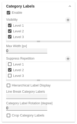
Category Labels(De-)activate the display of the category label using Enable. VisibilityThe checkbox controls row-by-row (level x) whether the category labels should be suppressed or displayed. Max Width [px]If this value is greater than 0, it indicates the reserved space for the category labels in pixels. If the length of the labels is greater than the specified width, they are shortened by omission points. For values smaller or equal to zero, the reserved space is calculated automatically. Max Category Label Width can only be set in Structure Mode and with deactivated hierarchical labels (Hierarchical Label Display set to false). Suppress RepetitionControls line by line (level x) whether repetitive category labels should be suppressed or displayed. Hierarchical Label DisplayEnables a hierarchical display of category labels. The category labels of each member are displayed in a separate column. The hierarchical display is only possible in Structure Mode. Line Break Category LabelsThe character or string in place of which category labels are split across multiple lines. For example, using a space for the label "ACT Jan 2001" would make it a three-line label. Category Label Rotation [degree]Specifies the angle by which the category labels are rotated. The rotation is counterclockwise. Crop Category LabelsIf this option is enabled, the category labels in Time mode will have a maximum width of the specified category width. If the labels are longer, they will be truncated by ... cut off. Category Labels from Measure (only in Power BI)This setting derives the category labels from the linked measures if no dimension is specified in the category field in the data pane. |
|
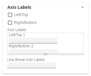
Axis LabelsLeft/TopActivate the check boxes to display the axis label on the left/top of the data series. Right/BottomActivate the check boxes to display the axis labeling on the right/bottom of the data series. Axis LabelsEnter the desired labeling of the axis manually. Line Break Axis LabelsThe character or string where the axis labels are split over several lines (similar to the property line break category labels). |
|
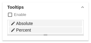
TooltipsIf this check mark is set, tooltips are displayed on the diagram at runtime, showing detailed information for the corresponding element. The tooltips cannot be activated in Power BI via the GPS. Please use the visualization Pane in Power BI and activate the Quick Info setting to display the tooltips in the graphomate charts. Value Format Tooltips Pop-UpDefine the number format using the following options:
|
|
Scripted FormattingHere you can define your own CSS for formatting the graphomate charts. | 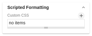 |