en GPS Tab6 Emphasis (bubbles)
- Stefanie Schröder (Unlicensed)
- Johannes Lentzsch
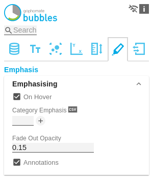
EmphasisingOn HoverWith this option, certain bubbles can be highlighted directly without moving the mouse over them. Category EmphasisA bubble is selected based on a portion of the contents of the category label. Several selectors are possible simultaneously. The entry is made per field or as comma-separated notation. For example, if the cardinal point is part of the category label and all bubbles from west and north are to be highlighted, the value of the property would be as follows: North,West Opacity of other BubblesThis value determines to what extent bubbles that are not highlighted should be hidden. The value starts at 0.0 (completely hidden) and ranges up to 1.0 (completely visible). AnnotationsIf this option is activated, Annotations are displayed at runtime when the mouse is moved over a bubble. Annotations are temporary labels that are connected to the bubble by lines and represent the respective value on the axis. For more tips on 'Hover', see the 'Runtime interactivity' section in the documentation. |
|
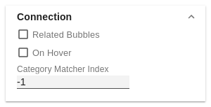
ConnectionRelated BubblesIf this feature is enabled, bubbles are connected in the order in which they appear in the data. This can be used, for example, to display temporal progressions or to mark the assignment of bubbles to each other more clearly. How bubbles are assigned to each other is defined by the Matcher Index. Redundant elements in the Category Label are hidden if possible and only displayed at the first element. On HoverDetermines whether the bubbles should be connected initially, or (if this option is activated) as soon as a bubble is highlighted with the mouse. Matcher IndexThis index defines how bubbles should be assigned to each other. The value -1 means that all bubbles are connected to each other. All values from 0 to n define the position of the category label of the element to be assigned. For example, if there are two bubbles, the first one has the category label "South, Internet" and the second one "South, Computers" and you want to assign all bubbles from the south to each other, select index 0 to use the first element of the category label. |
|
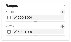
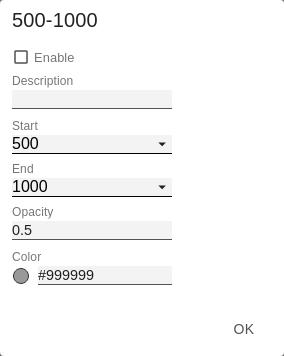
RangesRanges can be added to highlight complete areas of the X or Y dimensions. This is done by clicking on the +-symbol. Alternatively, one of the existing sample definitions can be activated and adjusted. The Ranges are divided into areas that should be marked on the X- or Y-dimensions. The checkbox in front of the definitions activates the respective range. Furthermore the following options are available:
|
|
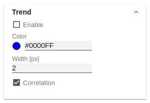
TrendThe checkbox activates the trend line. It is intended to visualize the trend of the development of the displayed data points and to make connections recognizable. This line is the regression line known from statistics, which represents the linear relationship of values in a Cartesian coordinate system. The following options are available:
|
|
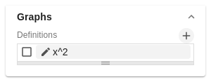
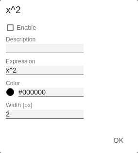
GraphsFor orientation in the coordinate system, various graphs can be added according to their function and then drawn. This is done by clicking on the + button. Alternatively one of the existing sample definitions can be activated and adapted. The checkbox in front of the definitions activates the respective graph. Furthermore the following options are available:
|
|