en GPS Tab8 Input Output (charts) SAC
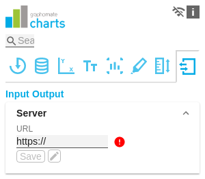
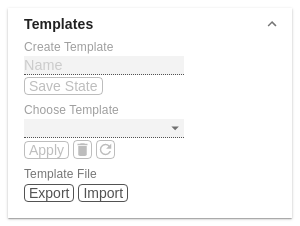
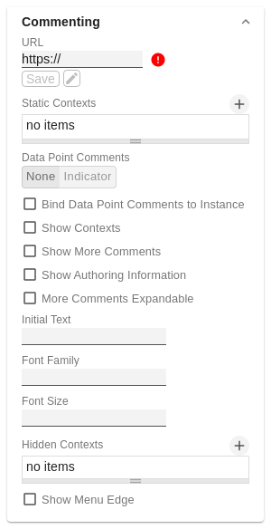
The functions of this tab are used to exchange templates for the graphomate charts. Connect to the graphomate server - a free component of graphomate GmbH - to store or load a graphomate charts template. This way you can exchange preconfigured graphomate charts designs between BI frontends that support the graphomate server. Here you enter the URL of the graphomate server to which the component should connect and from which you want to save or retrieve templates. The hyperlink "Admin" allows you to jump to the admin area of the graphomate server. Due to subsequent restrictions of the Power BI environment for external visuals by Microsoft, the graphomate server is unfortunately no longer available here. However, templates can be made available via export/import. If the current settings are to be saved as a template, a new template name can be entered in the input field labeled Create Template and confirmed by clicking the Save State button. If the entered name complies with the naming convention, the template is saved on the server and a toast with the corresponding message is displayed in the lower part of the graphomate property sheet. However, if the entered name does not meet the expected naming conventions, an error message with the permitted characters is displayed accordingly. With Choose Template templates stored on the server can be retrieved and applied. To do this, the desired template must be selected and the Apply button must be pressed. If you want to delete a template, you have to select the template in the list and press the Delete (bin) button. If changes have been made to the templates on the server side, you have to click on the Refresh button. Changes should then be visible. Using the Export and Import buttons you can distribute templates manually - without the graphomate server. This URL refers to the graphomate comments backend and is used to store comments and user administration. If the URL has been maintained once, it is usually not necessary to maintain it again in each instance of our comments and dashboard. Clicking on save checks whether the server is responding correctly. If this is the case, it is symbolized by a green "tick". At the same time, a link to the backend administration interface appears. Static contexts associated with the comment, such as a dashboard name or a dashboard page, can be maintained here. Data point comments, which are automatically defined in the context of the data point assigned to the chart, can be activated here. Indicator - If the option is active, an indicator is displayed at the top of the bar, which only becomes visible on hover if there is no comment and opens a window for creating the comment by clicking on it. If a comment exists, the indicator is always visible in orange. The comment can now be edited by clicking on it. Numbered - If this option is activated, the comment bubbles are replaced by numbered bubbles. This provides a quicker overview of the comments in conjunction with the standalone widget. Using this setting, you can define that data point comments only apply to this specific chart and are therefore not displayed in other charts with the same data context. A context with a randomly generated chart ID is then automatically added to the comment. If this option is activated, the number of contexts to which it currently applies is displayed above the comment. If this option is activated, more specific comments are displayed below the "main" comment. By activating this option, the person who created or last edited the comment is displayed below the comment. It also shows when this was done. The more specific comments are all displayed directly by default. As this could involve a very large number of comments, it is possible with this option that these are initially "collapsed" and are only displayed with a further click. If there is no comment, this status is indicated by a note text. This can be modified here. This function can also be used to create a basic structure for new comments as a template. HTML can be used here for formatting. Here you can define the font to be used for the comment text and the buttons in the comments. As not all contexts are set dynamically and therefore remain identical in every state of a dashboard, it can make sense to hide them. By defining a hidden context, it is possible to define that a context is used to classify a comment but is not displayed in the UI. All options are optional here. This makes it possible, for example, if only the "Environment Context" type is defined in the hidden context, for all contexts of this type to be hidden. All contexts with a specific key can also be hidden in this way. Shows a blue corner at the top right, which opens a menu. The currently logged in user is displayed in the menu and has the option of logging out. Decide how the comments context is displayed in the editor window.
Currently these are: SAP Analytics Cloud, Tableau, SAP Lumira Designer und MS365.Server Configuration
If you have entered the URL to the server, a green check mark indicates that a connection could be established.
If another server is used later, the button next to the save button can be pressed and the server URL can be edited.Templates
Template File
Commenting
URL
Static Contexts
Data Point Comments
Bind Data Point Comments to Instance
Show Contexts
Show More Comments
Show Authoring Information
More Comments Expandable
Initial Text
Font Family
Hidden Contexts
Show Menu Edge
Context display


