en GPS Tab3 Axes (matrix)
ColumnsDefault Width [px]At this point, define the default value for column width in px. The value auto causes the available space of the matrix to be divided among all columns that are assigned the default width, i.e. all columns for which the Width Per Column property does not specify a different value. Width Per Column [px]This property can be used to set an individual width for each column of the matrix. The column at position 0 corresponds to the row titles. The width is specified in pixels. Via the csv button you have the possibility to enter the column widths as comma-separated values. Column MarginsThis property sets the distance between columns, in any CSS length unit. Supress Repeating HeaderIf members repeat themselves consecutivley in a column header row, this property can be used to display them only once in succession. Header DividersHere you can set the visibility of the horizontal separator lines below column header cells. Header Divider ThicknessHere you can set the thickness of the horizontal dividing lines of column header cells. Select a CSS unit from the list (such as px, em). Header Divider ColorHere you set the color of the horizontal separator lines of column header cells as HEX, RGB or HSL code. You can switch this using the small arrows on the right side of the color picker, which can be opened by clicking on the colored circle. Header Text AlignSet here whether column headers should be left-aligned, right-aligned or centered. | 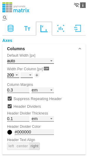 |
RowsSuppress Repeating Row HeaderIf members repeat themselves consecutivley in a row header column, this property can be used to display them only once in succession. DividersHere you set the visibility of the horizontal separator lines below data cells and row header cells whose rows are leaves of a hierarchy. That includes all rows which are neither column headers nor hierarchy nodes. Divider ThicknessSet the thickness of the horizontal separator lines below cells whose rows are leaves in a hierarchy. That includes all rows which are neither column headers nor hierarchy nodes. Select a CSS unit from the list (such as px, em), Divider ColorHere you set the color of the horizontal separator lines below cells whose rows are leaves in a hierarchy. That includes all rows which are neither column headers nor hierarchy nodes. Set the color as HEX, RGB or HSL code. You switch this using the small arrows on the right side of the color picker which can be opened by clicking on the colored circle. Initial Expand LevelHere you can set the starting drilldown state of the row hierarchy. "0" only shows the root node on the initial loading of the matrix. You need to reload the matrix or reopen your dashboard in order to see the initial expand level applied. Alternate Row StylingThis property makes the rows of the matrix alternately white and light gray which makes it easier to perceive individual rows. Crosstab-like Row HeadersActivate this property to split up the row header's hierarchy levels into separate columns. | 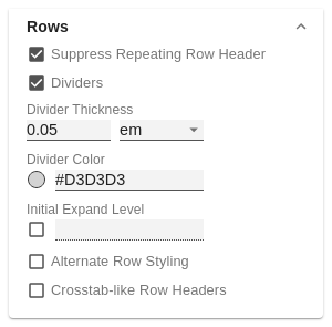 |