en GPS Tab2 Labels (matrix)
TitleIf the Enable checkbox is activated, the title will be displayed. Title TextEnter a Title for the matrix here. Multiline texts will be rendered accordingly, i.e. the line break will be applied. The following HTML tags can be used for formatting: 'b', 'i', 'p', 'span', 'div', 'br', 'h1', 'h2', 'h3', 'h4', 'h5', 'h6', 'hr', 'ol', 'ul', 'li' and 'blockquote'. For the following result this input is necessary: ACME Ltd. SizeEnter the size of the title's font. Select a CSS unit from the list (such as px, em), | 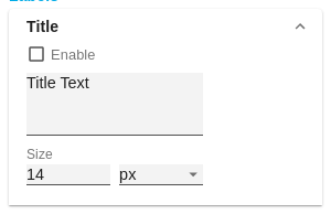 |
FontSizeEnter the size of the font. Select a CSS unit from the list (such as px, em), FamilyDefine the global font. Clear the contents of the text box, and then choose Arial, Tahoma, Verdana, Lucida Console and Calibri from the suggested values. Alternatively, you can enter the name of a font installed on your system, even if no suggestions are displayed. For example, enter Comic Sans MS. ColorThis property defines the font color as HEX, RGB or HSL code. You can open a color picker by clicking on the colored circle and switch the color model by using the small arrows on the right. Crop Header TextsWhen this option is selected, long character strings are not wrapped but abbreviated with three dots - e.g. electronic prod... | 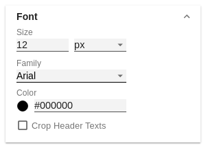 |
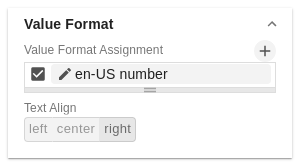
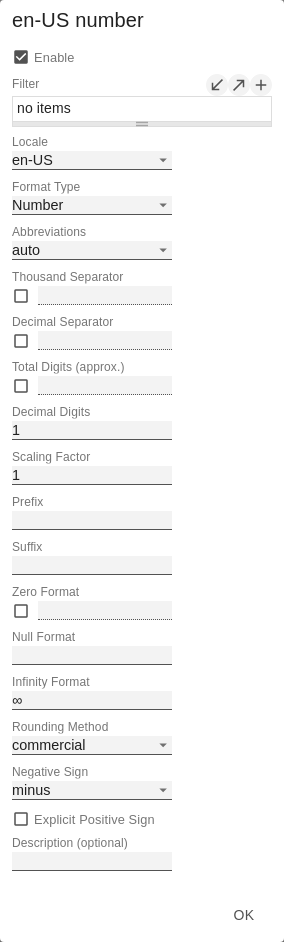
Value FormatWith the Value Format you define the way the values are displayed in the matrix. You can define several formats and assign them to specific columns using filtering. Multiple Value Format Rules (Assignments) are prioritized in descending order, i.e. definitions that are lower in the list overwrite those above them when there filters overlap. Therefore, the generally valid format of the table should be defined at the top of this list without any further filters. Value Formats defined below, restricted by filters, overwrite the formatting defined above - "From General to Special". Value Format AssignmentYou can access the configuration by clicking on an element in the list. You define another Value Format by clicking on the Value Format Pop-UpDefine the number format using the following options:
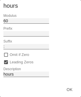
Time Units Pop-UpFor the Format Type Time, a system of units can be configured with the help of the Time Units Property, which in the default setting consists of hours and minutes. Each number formatted in this way is then splitted in its values for each unit. The order of the unit list defines their relationship from the largest unit (top) to the smallest unit (bottom). Each unit contains the following options:
Text AlignmentSpecify how text content is aligned in the matrix: left-aligned (left), centered (center) and right-aligned (right). |
|
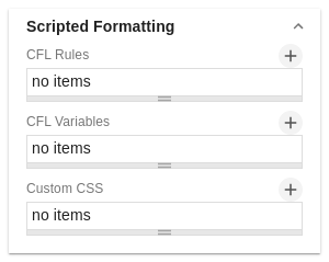
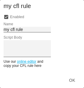
Scripted FormattingCFL RulesLearning from the usage of other table components we decided to offer our customers a possibility to format the graphomate matrix very individually according to their requirements. The Cell Formatting Language (CFL) enables you to define rules which are executed for each cell of the matrix. These rules can be used to manipulate the appearance of cells based on cell properties, data properties or matrix properties. In this way, you can create a heat map, color elements, or apply conditional formatting with a few lines of code. Cell Formatting Language: The CFL is a script language for individual formatting of the graphomate matrix based on JavaScript syntax. To simplify the programming of the CFL, we provide a web-based CFL editor from which the defined rules can be easily copied and pasted into the script body. This editor and some code templates can be found here. For all CSS properties and values that can be set in the CFL, the usual notations apply. CFL-Pop-UpThe following properties can be defined:
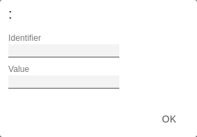
You can find the CFL editor here. CFL VariablesAt this point you can define your own variables that you want to use in a CFL rule. In The CFL Rule, the variable is accessed via the .getCflVariable method. The value of the variable must comply with the JSON format (examples: 5 or "center" or [1,2,3] or null or {"foo": "bar"}. CFL Variables Pop-UpThe following properties can be defined:
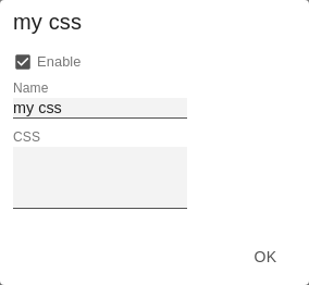
Custom CSSUse CSS code directly for the matrix if you cannot address complex selectors in the styling via the CFL. Custom CSS Pop-UpThe following properties can be defined:
|
|
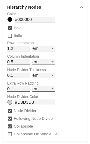
Hierarchy NodesHere you control the color and font style of the hierarchy nodes in the table. ColorHere you define the font color of the Hierarchy Nodes. The color overwrites the general font Color from the Font group. BoldIf you want hierarchy nodes to be displayed in bold, activate this property. ItalicIf hierarchy nodes should be displayed in italics, activate this property. Row IndentationSpecify the size of the indentation of hierarchy nodes here. The indentation that is ultimately used is a multiple of the indentation set here and depends on the hierarchy level of the respective node. Select a CSS unit from the list (such as px, em). Column IndentationSet the size of the indentation of columns here. The final indentation used is a multiple of the indentation set here, and is based on the hierarchy level of the node in question. Select a CSS unit (such as px, em) from the list, Node Divider ThicknessSet the thickness of the horizontal separator lines below cells whose rows represent hierarchy nodes. All other separators can be set in the tab Axes. Extra Row PaddingSet here the value of the additional line spacing that will be applied to separate groups of child nodes and their parent nodes from each other. Choose a CSS unit from the list (such as px, em), Node Divider ColorHere you can set the color of the horizontal separator lines below cells whose rows represent hierarchy nodes. All other separators can be set in the tab Axes. Following Node DividerThis setting determines whether lines before or after a hierarchy node are interpreted as a separator line of the hierarchy node. All other separators can be set in the tab Axes. CollapsibleIf the hierarchy should be expandable and collapsible, activate the Collapsible property. Collapsible On Whole CellIf this property is activated, clicking anywhere into a cell causes the hierarchy node to expand or collapse. Selecting entire rows is not possible this way. If this property is inactive, only a click on the triangle causes the collapse, while a click on the rest of the cell only results in a selection of the row. |
|
StylingMatrix Background ColorDetermine the background color of the matrix using Color Picker or HEX, RGB or HSL code. You can switch this using the small arrows on the right side of the color picker. Matrix PaddingThis property determines the outer padding of the matrix component. Select a CSS unit (such as px, em) from the list. | 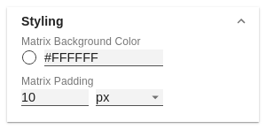 |
FooterFooter TextEnter the Footer text for the matrix in this field. Multiple-line texts are reproduced accordingly, i.e. the line break is adopted. SizeEnter the footer's font size. Select a CSS unit from the list (such as px, em), | 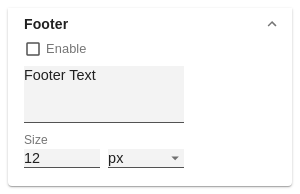 |