Data Series Selection
- Tim Schauder
- Stefanie Schröder (Unlicensed)
- Konradin Schoemers (Unlicensed)
Each series button  is used to select exactly one data series.
Important: Series 1 needs to include the category labels for all data points; all other series take their labelling from this selection according to their position in the cell selection. Please make sure that cells containing labels are formatted as text. If you want to use year dates as category labelling, convert them to text with a leading apostrophe (´). Otherwise, these will be interpreted as values, which can lead to unintended behavior. We recommend a column-oriented data layout with at least one category label at the start of each row (see picture below).
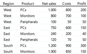
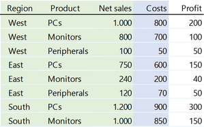
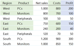
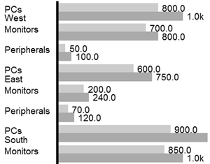
In this example, the first column contains the dimension Region with three characteristics. The second column contains the dimension Product, equally with three characteristics. The last three columns hold the data series Net Sales, Costs and Profit. Pleae note that cells containing category labels can't be grouped – you can't join the three cells with the label West to a single cell. Now, if you want to assign data to a series, first click on one of the series buttons and select one of the data columns. If you want to use category labels – the first two columns in our example – select them only with the first data series. An example is shown below: series 1 is shaded in green, series 2 is shaded in blue.
 |
|
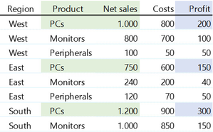
The category labels selected with the first data series are mapped internally to all other data series. Please note that with the first series is linked to data as well as all category labels. It is possible to include column headers in your selection; these are currently ignored, though. It is also possible to select only parts of a table. This can be done by pressing STRG/CTRL while selecting individual cells or cell ranges with the mouse. Likewise, the connection between data and labels is constructed via the row index – see the examples below.
|
|
|
|
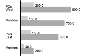

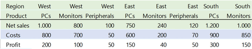
Basically, graphomate charts for Excel support the selection of rows as data series – see below. However, this can lead to misinterpretation of the data and is not recommended. We advise to utilise the layout described above, with data aligned in columns.
Changes to data or labels will be automatically updated in the chart – when using SAP Analysis for Office, please see the notes under Usage with SAP Analysis for Office. An exception to the automatic update is cutting and pasting of data: in this case, the selection is not automatically adjusted to the new range. We recommend to release the selection with a click on X prior to moving the data, and reassign it to the new cell range.
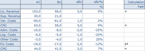
special data for waterfall chart: