Introductory Examples
- Tim Schauder
- Stefanie Schröder (Unlicensed)
- Konradin Schoemers (Unlicensed)
Chart Types
graphomate charts for Excel offer a whole range of new chart types which can be extensively customized according to your reporting requirements. We distinguish between the following chart types:
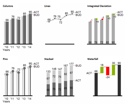
We recommend these chart types for visualization of developments over time.
For the comparison of structures or hierarchies we recommend the use of charts with a vertical category axis:
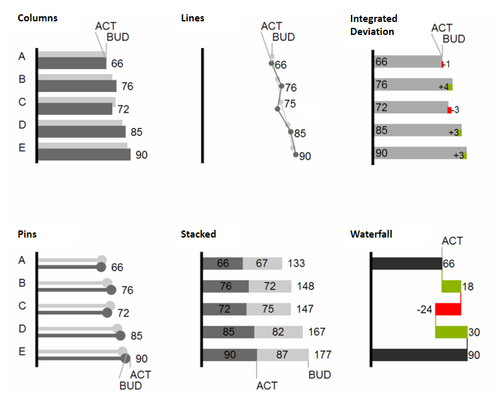
All charts can always be used in vertical or horizontal orientation. The Comparison Group enables you to use the same scales. Each chart must be assigned to the same Comparison Group. It is possible to use up to 10 data series – either consecutively or – in a stacked chart - on top of each other. The name of a data series can be displayed at the data series itself or alternatively on the axis of the base chart.
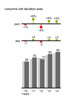
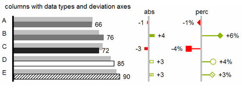
Deviation Axes
With a simple mouse click, graphomate charts for Excel enables you to set additional axes above all chart types, which display the percentage or absolutes deviations between two data series. Of course you can name the deviation series and display the names in the chart.

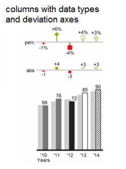
Data Types
Furthermore, each element of a chart can be formatted independently. This is achieved by using the Data Types. These Data Types enable you to use a customized visual language for your company. Data Types are defined in the Data Types Editor and then they are attributed to each element of a Data Series on the tab Data. The color, filling, shape and width of the chart elements can be defined by using Data Types. Please note that the use of Data Types affects the deviation axes: The Data Type of the Measures can be seen in the elements, the Data Type of the Base values is used in the axis – as long as the axis has a thickness of at least 3 px.
Visual Elements of the graphomate charts
These examples are valid for all chart types – in structure and time depictions.
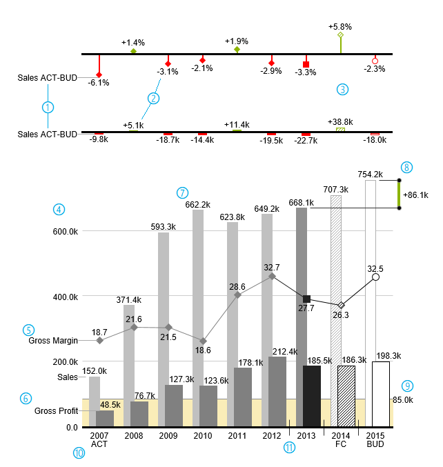
- Percentage and absolute deviation between data series with data series labels.
- Percentage and absolute data labels can be formatted independently.
- By using Data Types, the chart elements and axis carry information: deviation of forecast (hatched) to budget data is shown. Therefore the deviation axis is hollow.
- A value axis with help lines can be displayed optionally for all charts.
- Charts can be superimposed, thus enabling you to depict combination charts - in this case a line chart with data series labeling and data types for previous periods (grey rhombus), actual (black square), forecast (hatched rhombus) and planned data (hollow).
- Column chart with two data series (-labels) and use of data types. Sales are shown with lighter and narrower columns, which can be controlled centrally by the use of Data Types.
- Data labels are free to define. For example, use the apostrophe for the representation of millions.
- Emphasize the difference between two elements with the function Highlight.
- Scaling helper show different scales of charts.
- Multi-line axes labels are automatically copied from the source data.
- So-called Separators help to structure the category axis.
Waterfall Charts
A waterfall chart – often also called a flying bricks chart or, in finance, a bridge shows how an initial value is increased (inflow) or decreased (outflow) by a series of values, which lead to a final value – if necessary with subtotals and spans. For a flexible use of the waterfall in graphomate charts for Excel an additional Data Series has to be defined: the Waterfall Calculation Path. This Data Series determines, whether the value to be shown is an in- or an outflow value. For further information to the Waterfall Calculation Path see appendix. It is, of course, possible to use the waterfall horizontally or vertically, just like all other charts. Additional deviation axes are also possible. Furthermore, Data Types can be used for formatting. Please note that Data Types will overwrite the colors of in- and outflows as well as the colors of sums and spans which have been defined on the tab Appearance.
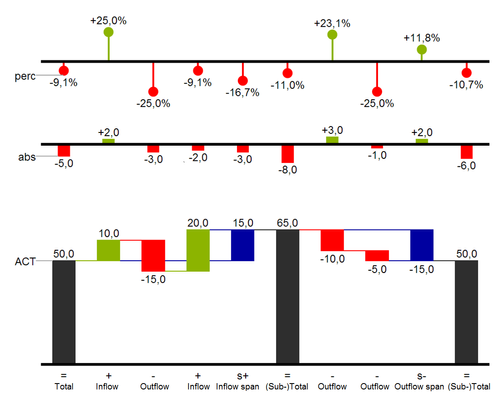
Above you can see a visualization of the operators for the calculation path and their effects on the elements of the waterfall chart. The following table gives some more explanations: