Properties
- Tim Schauder
- Stefanie Schröder (Unlicensed)
- Jonas Volger (Unlicensed)
- Konradin Schoemers (Unlicensed)
Basically, there are two possibilities to maintain the features of graphomate charts for Excel: with the Basic Properties Sheet, which lists all parameters in a structured list or with the Additional Properties Sheet. The latter provides a user-friendly interface. There are some special features, which can only be maintained on the Basic Properties Sheet.
The Checkboxes next to the features in the Additional Properties Sheet are used to control the visibility of chart elements.
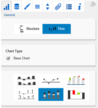
General TabOrientationAll charts can be used in horizontal or vertical orientation:
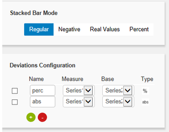
Use the toggle button to select Structure/Time. Chart TypeChoose the preferred chart type via mouse click on the corresponding icon. With the Checkbox Base Chart you can display or hide the Base Chart. This way, you may use deviation charts without the Base Chart. Stacked Bar ModeThis option is visible, if the stacked bar chart ist selected. It switches between the different stacked bar chart modes. Deviations ConfigurationThese Checkboxes activate - additionally to the Base Chart - axes for absolute or percentage deviations of two Data Series. A click on Name enables the renaming of the deviation series. This Name is also used as a legend. Use the dropdown boxes to choose the Data Series for the calculation of deviations according to the formulas on the right. Click the button Type for selecting between absolute and percentage deviation. Delete deviation series by using the red button and add new by using the green button , which will be shown above the Base Chart. The order of the display corresponds with the order in the Deviations Configuration. |
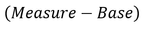
 Formula for calculation of absolute deviation:
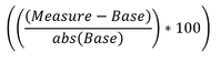
Formula for calculation of percentage deviation:
|
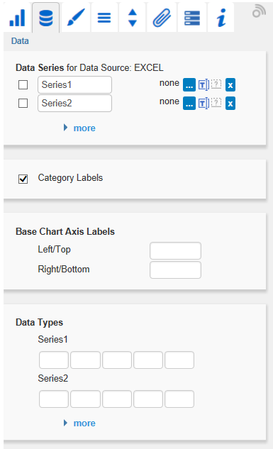
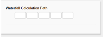
Data TabData SeriesHere you can link up to 10 Data Series from the Data Source that you want to display by clicking the corresponding  , you can toggle the chart type for each series separately. By default (question mark selected), the setting from the general tab is used. With this feature you can get automatic chart layering. , you can toggle the chart type for each series separately. By default (question mark selected), the setting from the general tab is used. With this feature you can get automatic chart layering.Category LabelsCategory Labels are shown in the chart, when the Checkbox is activated. Category Labels are automatically created from the meta data of the Data Source. Base Chart Axis LabelsDefine additional axis labeling here. To show these labels the Checkboxes on the Helper Tab must be activated. Data TypesSpecify here the Data Type of each element of the selected Data Series. Each element can be formatted individually. The entered Data Types are converted to uppercase in the background, so they are not case-sensitive in order to prevent possible sources of errors. Waterfall Calculation PathTo use a waterfall flexibly, it must be first determined whether the value to be displayed is either a total or an in- or outflow using an additional Data Series. This is carried out by using our so-called Waterfall Calculation Path (see input options on the right). |
Values for the Waterfall Calculation Path:
|


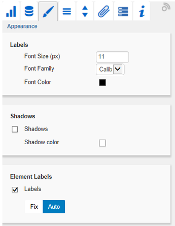
Appearance TabLabelsSet the font size, the font family and the font color for labels in the chart. In addition, shadows with defined colors can be added to accentuate the labels if the background is colored. ShadowsIf activated, an rect is drawn behind the Element Labels. With Shadow color you can define the color value. Element LabelsIf the Checkbox is activated, all elements of the chart will be labeled. The toggle buttons Fix/Auto determines the visibility of the labels:
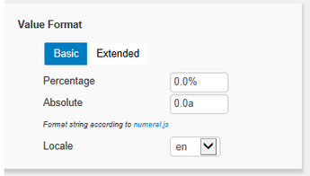
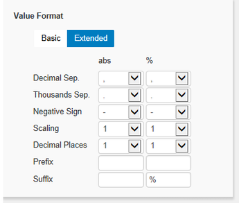
Value FormatSelect the format of the Category Labels:
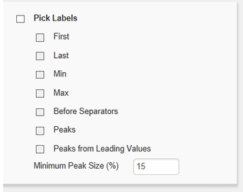
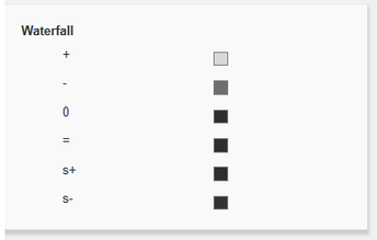
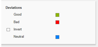
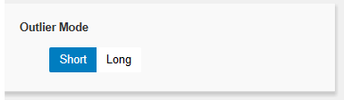
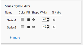
Pick LabelsIf this option is activated, the underlying options controls, which labels are shown. Only those labels are shown, which meet one of the criteria. The following options can be picked: First: The first label of each series is shown Minimum Peak Size in %: Defines, how large the difference to the neighboring values must be, to consider the value as a maximum/minimum WaterfallThe colors of the elements of a waterfall can be set here - corresponding to the calculation path. Please note that the use of Data Types overlap this standard format. DeviationsSet the colors for deviations. If positive deviations between measures and base values are not regarded as positive, for example for comparisons of actual vs. budget costs, activate the Checkbox Invert. Outlier ModeChoose the appearance of the outliers here. In the mode Short the outliers are shown as small triangles on the axis. In the mode Long they are drawn over the entire available area – according to the rules by IBCS. Series Styles EditorIn this editor the appearance of the Data Series is determined, as long as you do not use Data Types. Data Types overwrite the Series Styles. The handling is similar to the definition of Data Types on the Data Types tab, the name is derived from the data series name. Color, Fill and Shape determine the appearance of the elements. Shape refers to the pin heads. Navigate via mouse click through the alternative representations. Width determines the width of the elements. The values can be given in percentage of the category width as well as in absolute values in [px] – just toggle %/abs. The parameter Width can only be used in bar or column charts. If necessary, please use the parameter Bar Width in the Standard Properties Sheet for the elements width of other chart types. |
|
Data Types TabData Types EditorThis editor is used to define Data Types. The abbreviations can be used on the tab Data and it is possible to format each element individually. The abbreviations are defined in the column Name. Color, Fill und Shape define the appearance of the elements. Shape refers to pin or line heads. Navigate via mouse click through the alternative representations and view the changes in the chart, after you assigned the corresponding Data Type. The column Width determines the width of the elements. The values can be given in percentage of the category width as well as in absolute values in [px] – just toggle %/abs. The last column Bold sets the font type of the label of the Data Type to bold. With the red button next to Data Type you delete Data Types and with the green one you add new Data Types. Data Types are used globally within an Excel workbook. For this reason Data Types will automatically be adopted for all other graphomate components which use Data Types. | 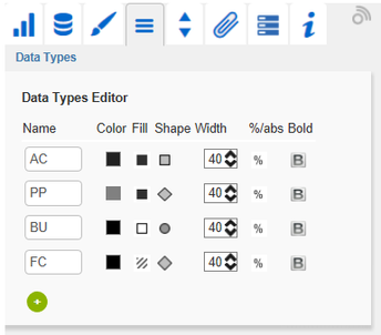 |
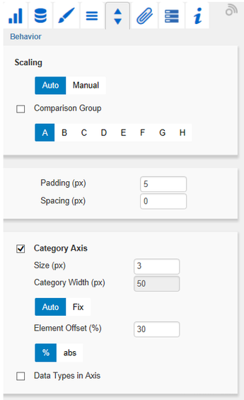
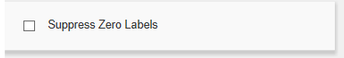
Behavior TabScalingThe default Auto scales the chart according to the Min and Max-values of all selected data. Several charts can be scaled identically by using the same Comparison Group, which is activated by the Checkbox. That way the Min and Max of the data basis in this group is used. Comparision Groups are used inside a worksheet. Alternatively it is possible to set the Min and Max scaling values under Manual. Retrieve values proposes valid values! Chart Min values > “0” cut the value axis. The script method getClickedPositionValue enables an interactive zooming. Padding in [px] gives a margin to the chart. Spacing also in [px] denotes the space between base and deviation chart. Category AxisActivate the Checkbox to show the category axis. Size defines the thickness of the axis in [px]. With Category Width the width can be defined as Fix in [px] or automatically set with Auto. The parameter Element Offset determines the shift of elements on the Category Axis. Using the toggle button %/abs allows you to set the value in percent or absolute in [px]. Use negative values for a shift in the opposite direction. Data Types in AxisIf the Checkbox is activated, Data Types of the first Data Series are shown in the axes as long as the Size is at least 3 [px]. Suppress Zero LabelsIf the Checkbox is activated, the labels of zero values are hidden – both in the Base Chart and in the deviation charts. |
|
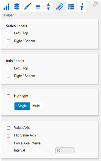
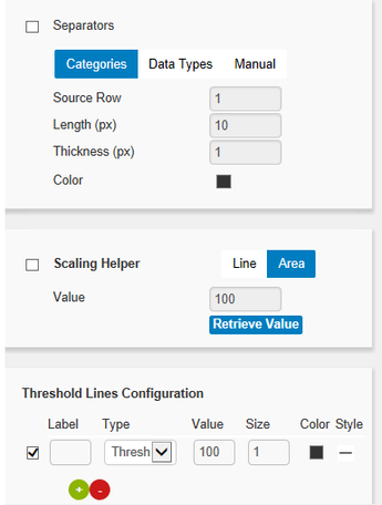
Helper TabSeries LabelsActivate the Checkboxes to show the data label on the Data Series. Axis LabelsActivate the Checkboxes to show the legend at the axes. HighlightThis function enables you to highlight the absolute or percentage difference between two elements. Activate the Checkbox and set an index for elements where the highlighting should start and end. Value Axis/Flip Value AxisActivate the Checkbox Value Axis to show value axes and help lines approximately according to the interval. SeparatorsYou have the option to set so-called Separators in the chart. These can be set automatically in case of changed Data Types or Categories, or they can be set Manually – according to the selected toggle button. Scaling HelperActivate the appearance – line or area – and the position of the Scaling Helper at this point. Threshold Lines ConfigurationIn this panel you can configure custom horizontal lines, e.g. to indicate certain thresholds. You can define the thickness, color and style of the line and label it. |
|
Server Tab (Also see Server Properties)Server ConfigurationHere you can enter the Server URL to which the component should connect and from which it should retrieve the templates. The hyperlink below the buttons allows you to jump to the admin. Templating ConfigurationIf the current settings are to be saved as a template, a new template name can be entered in the input field with the name Create Template and confirmed by clicking the Save current State button. If the naming convention entered is correct, the template is saved on the server and a toast with the corresponding message is displayed in the lower part of the Additional Properties Sheet. However, if the name entered does not meet the expected naming conventions, a toast with the permitted characters is displayed accordingly. Templates stored on the server can be retrieved and applied via the Template List. Just select the desired template and press the Apply button. If you want to delete a template, select the template in the list and press the Delete button. If changes have been made to the templates on the server side, the list must be updated via the Refresh List button. Changes should then be visible. | 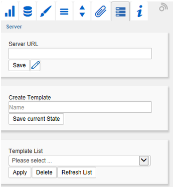 |
Info TabHere you will find the version number of our graphomate charts as well as a link where you may report bugs or propose wishes for new features. A list of all open-source libraries that we used can be found under Credits. | 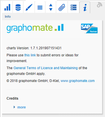 |